
city of Beaumont
When I joined Beaumont’s Communications team, the City had an approved identity, but its use had become inconsistent. Different colors, fonts, and logo treatments had made their way into materials across departments.
Our team dug through old files and institutional knowledge until we recovered the most recently approved branding. From there, I wanted to understand what those elements communicated and how I could carry that into the work.
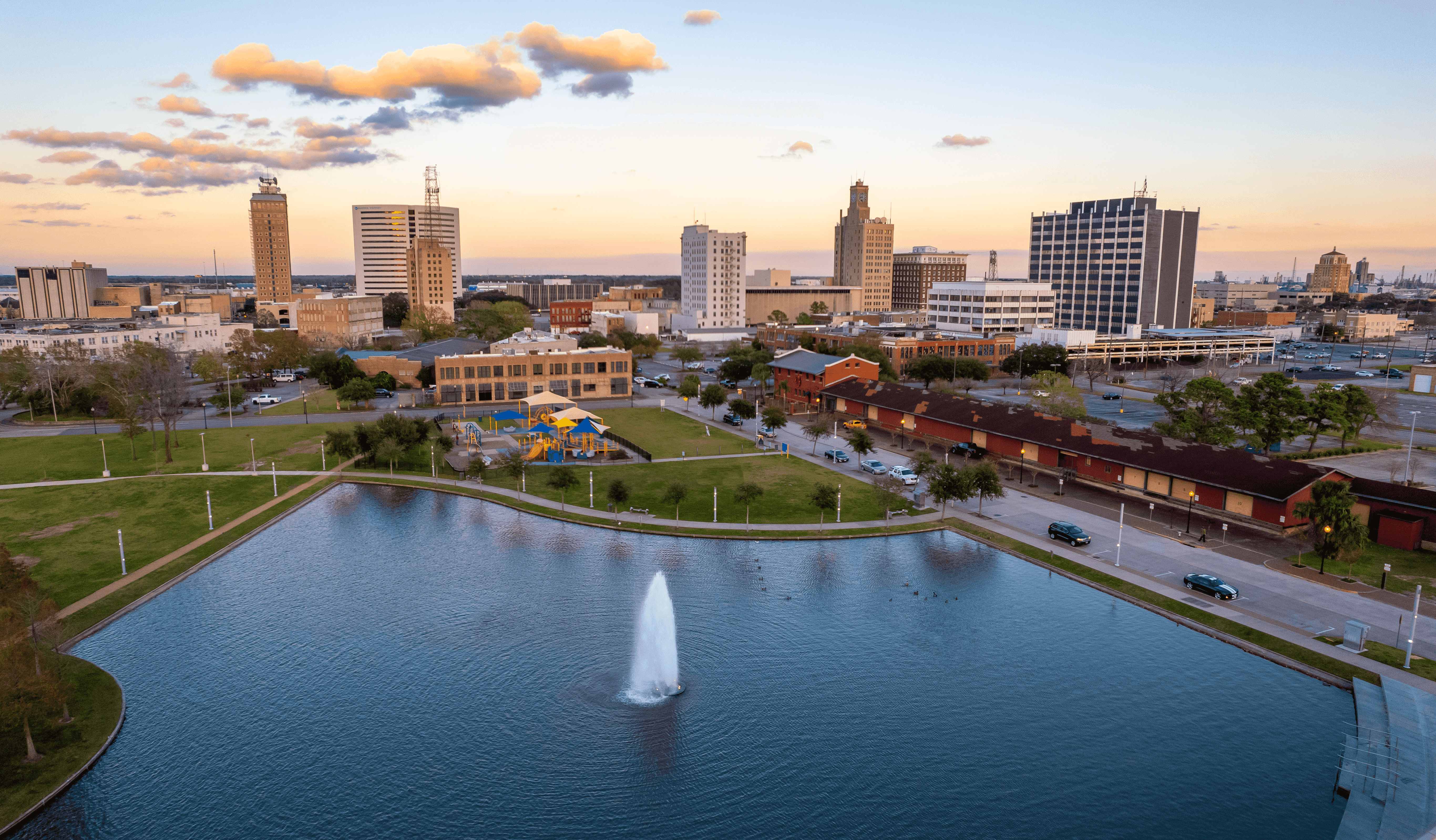
Finding the foundation
The strong wordmark, limited palette, simple geometry, and tilted star felt dependable and approachable. That became the starting point for my design and art direction.
I wanted to keep what made Beaumont recognizable while giving the identity enough flexibility for the City's needs.
Beaumont already had recognizable assets. My job was to make those assets work together consistently enough that people could recognize the City across vastly different communications.
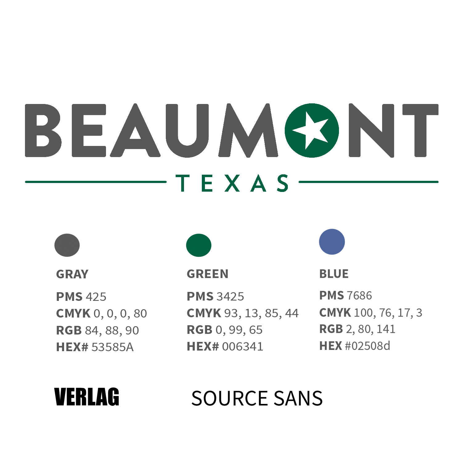
The identity had a civic mark, strong sans-serif typography, limited palette, rounded geometry and a tilted star, from reviewing documentation and a designer's perspective, conveyed an approachable and stable institution.
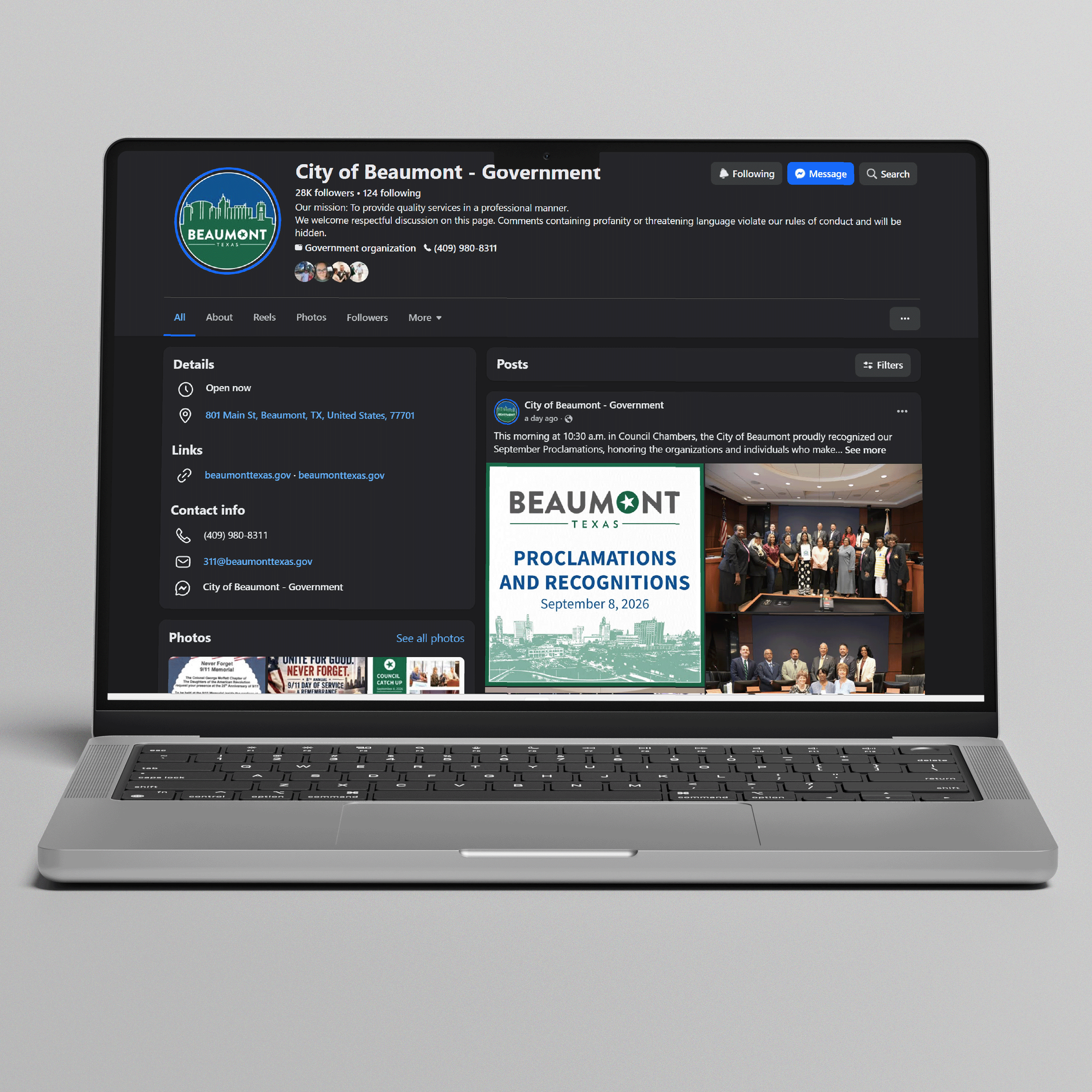
The lined skyline was already being used. I brought it into a new composition that became the City’s social avatar, keeping a familiar element while bringing its use closer to the approved identity.
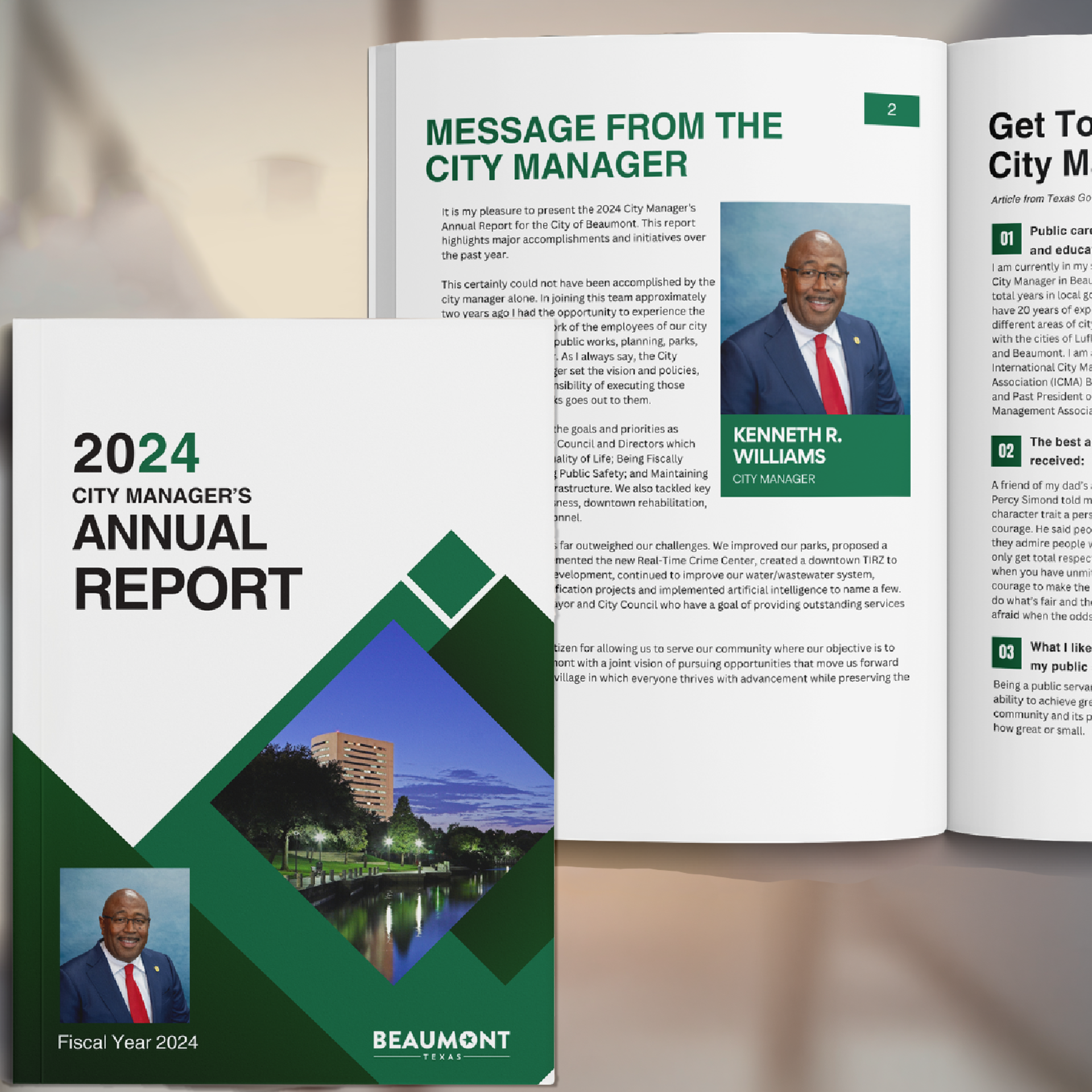
The City Manager's Annual report and slide deck, created for a presentation tour, received the Award for Excellence from the Texas Association of Municipal Information Officers (TAMIO).
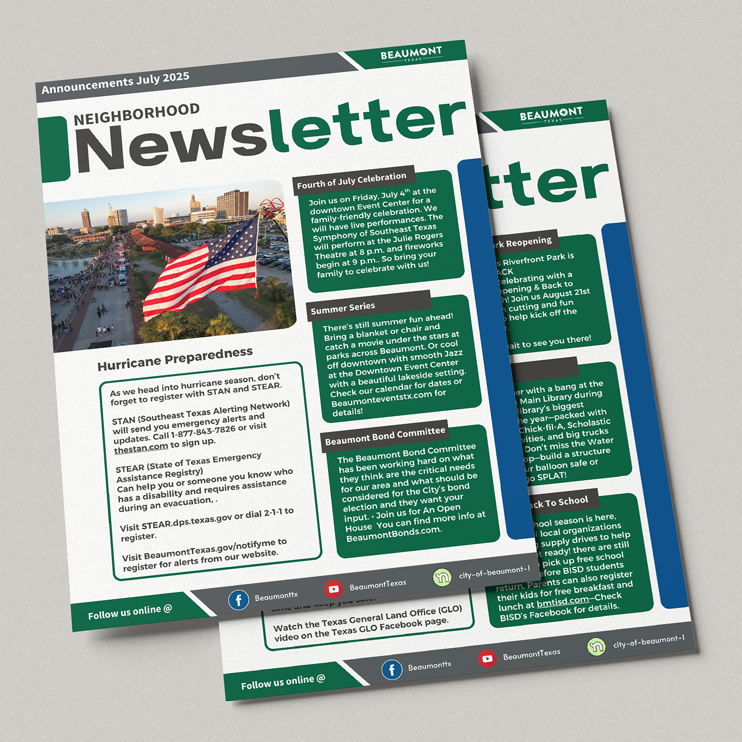
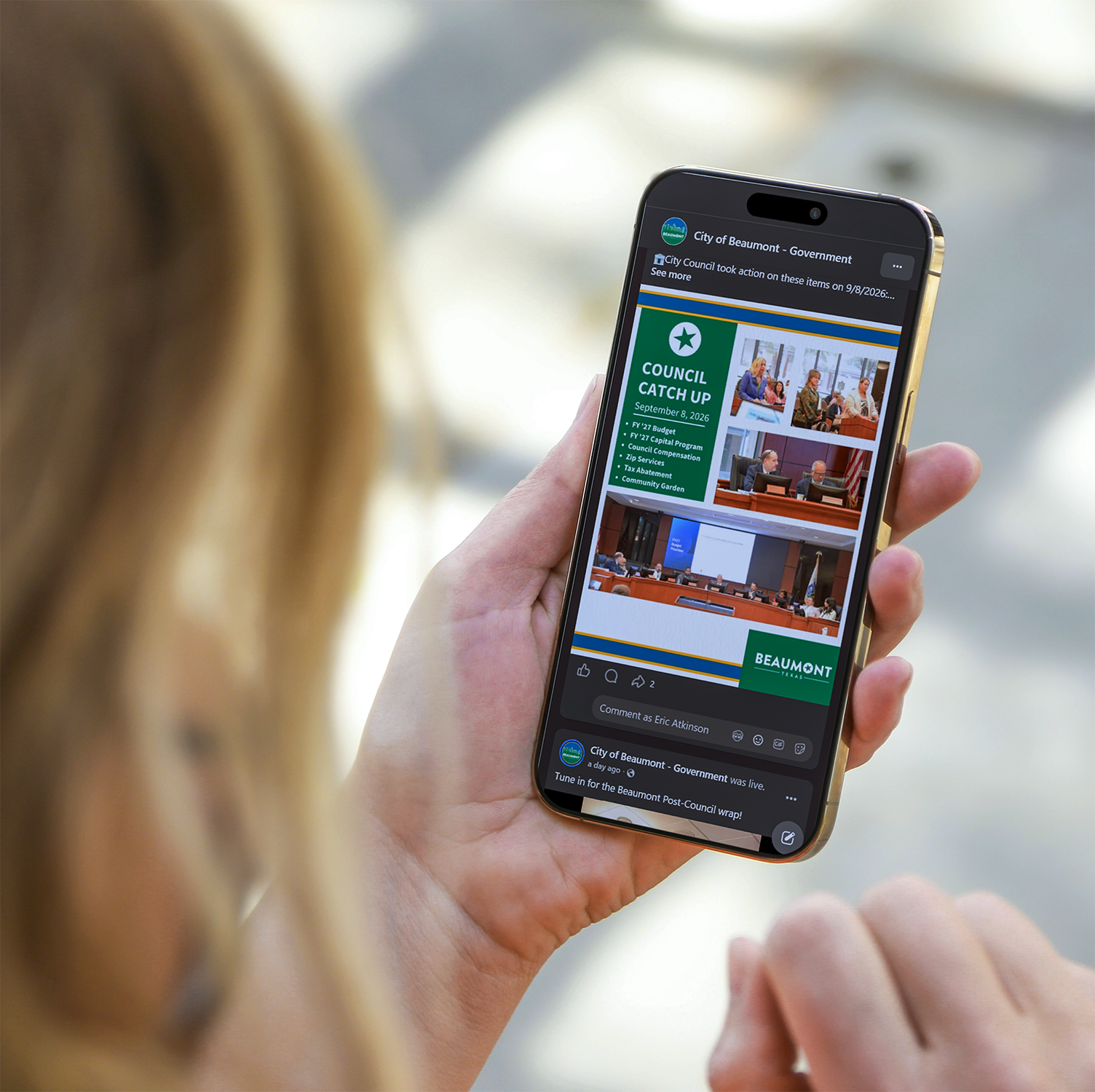
Templates and shared assets included social posts, monthly reports, newsletters, and internal materials. The designs use bold shapes and strong typography to separate articles and information.
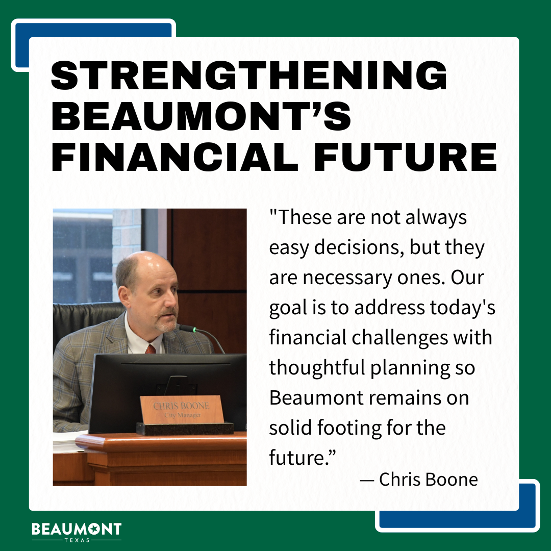
Making the identity work every day
I carried the strength of the wordmark into bold typography and simple geometric forms. Green provides a recurring, growth-focused presence, with blue and white providing compositional contrast and flexibility. Rounded shapes and photography of our people and places keep that strength approachable.
Those relationships allow the tone to change with intention. The Annual Report presents the City with formality and confidence. The newsletter brings that same identity into regular neighborly communication. Social graphics give recognizable messages. Holiday Day ads place the people delivering our services at the center of the identity.
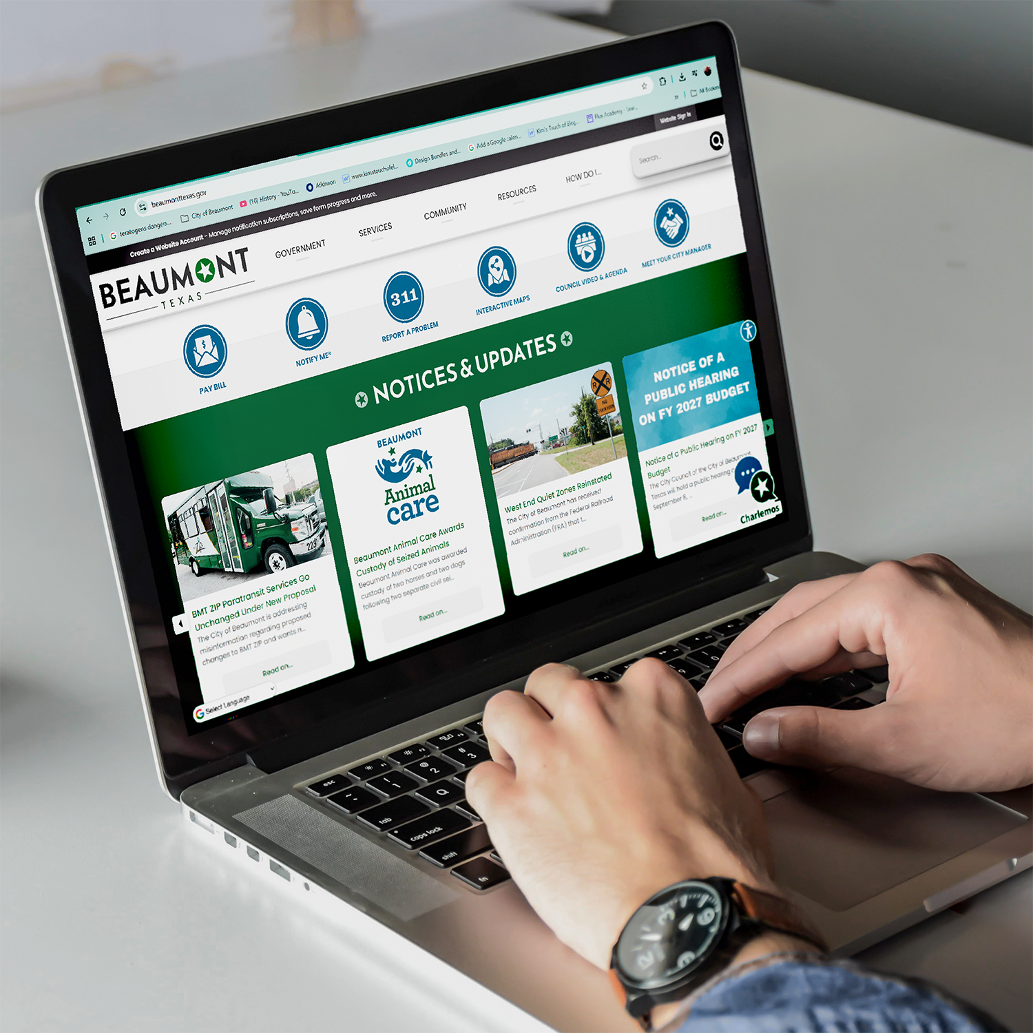
Across print and digital, the aim is a consistent impression of Beaumont: capable, connected to its community, and accessible to the people it serves.
The consistency comes from repeating the characteristics that make the identity recognizable while giving each communication the expression it needs.
Making that consistency last also meant helping other people work with the identity. I created recurring templates and shared assets, made resources easier to find, and provided critique and design guidance so coworkers could carry the same approach into new materials.

Making room for more character
I was asked to design a new identity for the Sterling Pruitt Activity Center(SPAC). After an initial discovery meeting, we determined that SPAC had a specific audience and needed an identity that reflected what it offered while still belonging to Beaumont.
Stakeholders wanted sports-themed lettering, a banner, the facility name, their new tagline, and imagery showing all their activities. There was a lot they wanted to include.
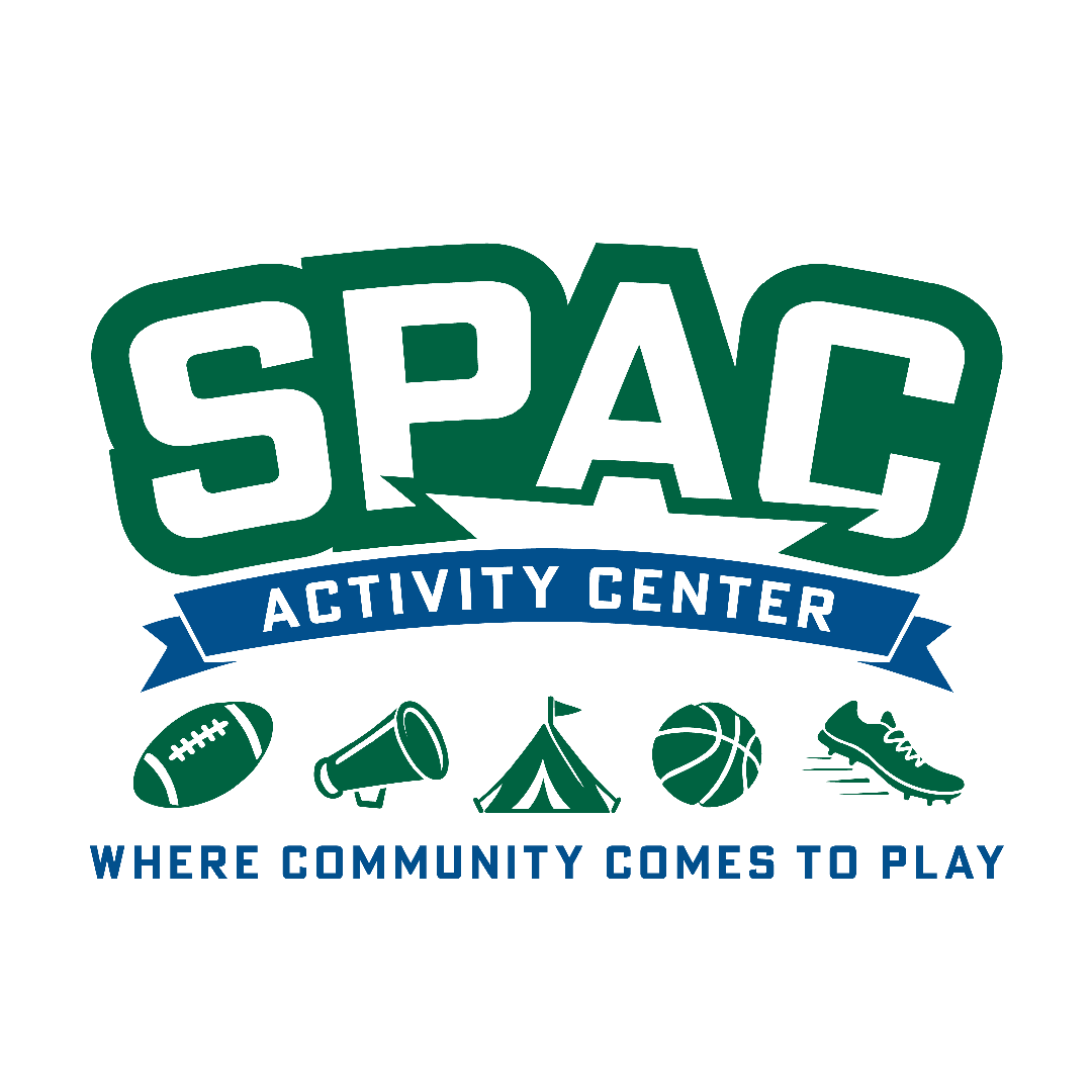
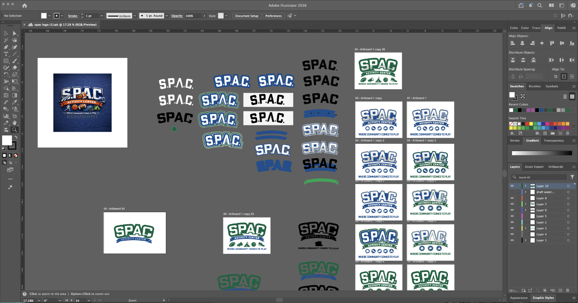
I started with athletic lettering and tested the arch, outlines, and shading. The multitone treatment felt more trend-driven than I wanted, so I returned to the bold simplicity of Beaumont’s branding.
Outlined letters and a gentle arch gave SPAC friendly energy. I noticed that the inner A could make the top point of a star and developed that connection to bring in both Beaumont’s star and the “all-star” association.
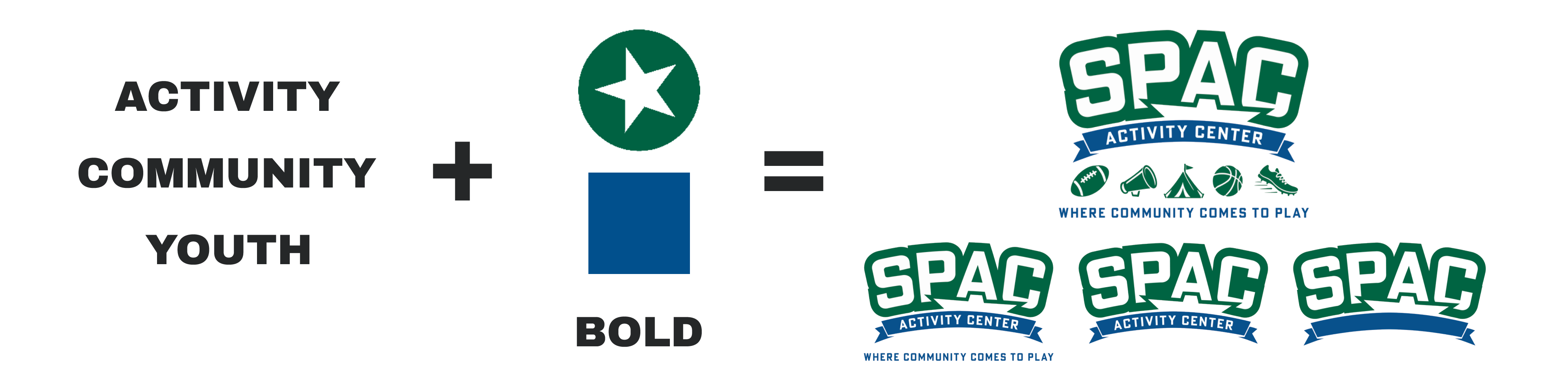
The inner A forms the star’s upper point. The banner helps create the negative space beneath it, which is why it remains even when its text is removed.
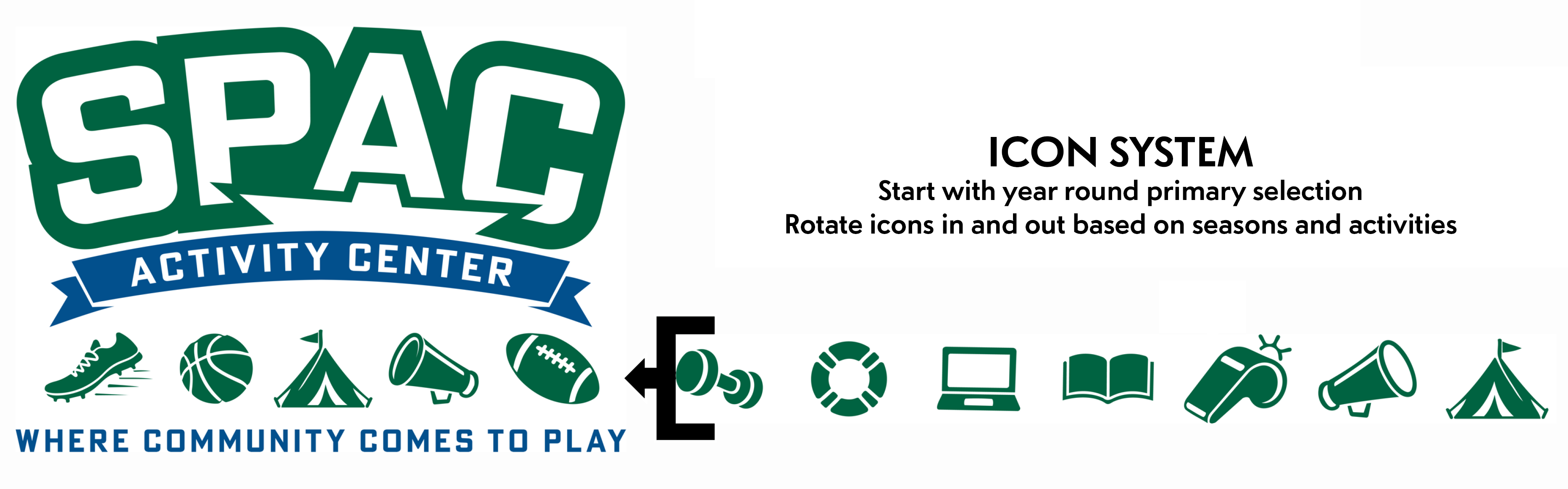
Fifteen activity icons allow the selection to change with the programming. Smaller lockups remove supporting elements while keeping the core mark recognizable.
I suggested placing activity icons below the main mark, allowing the activities room without making them permanent parts of the logo. The default selection represented year-round programming, but the icons could change for a season or something specific, like summer camp.
“Where Community Comes to Play” completed the full lockup. From there, elements could be removed for smaller uses. The facility could have a full welcome on its building, a simpler identity on social media, and a compact mark where space was limited.
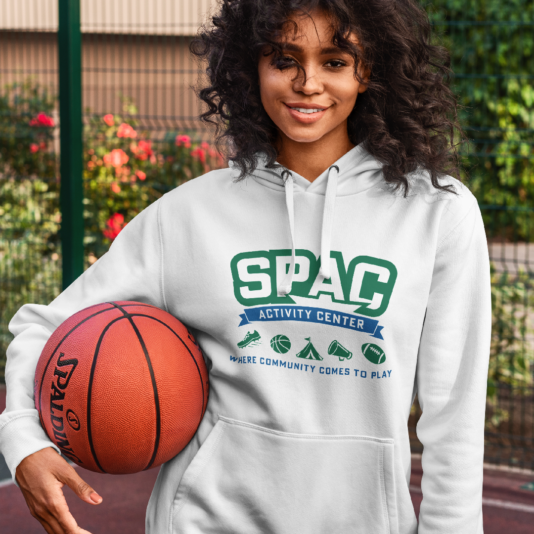
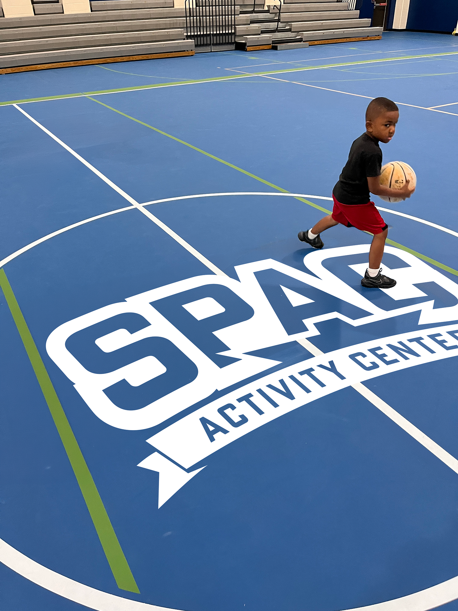
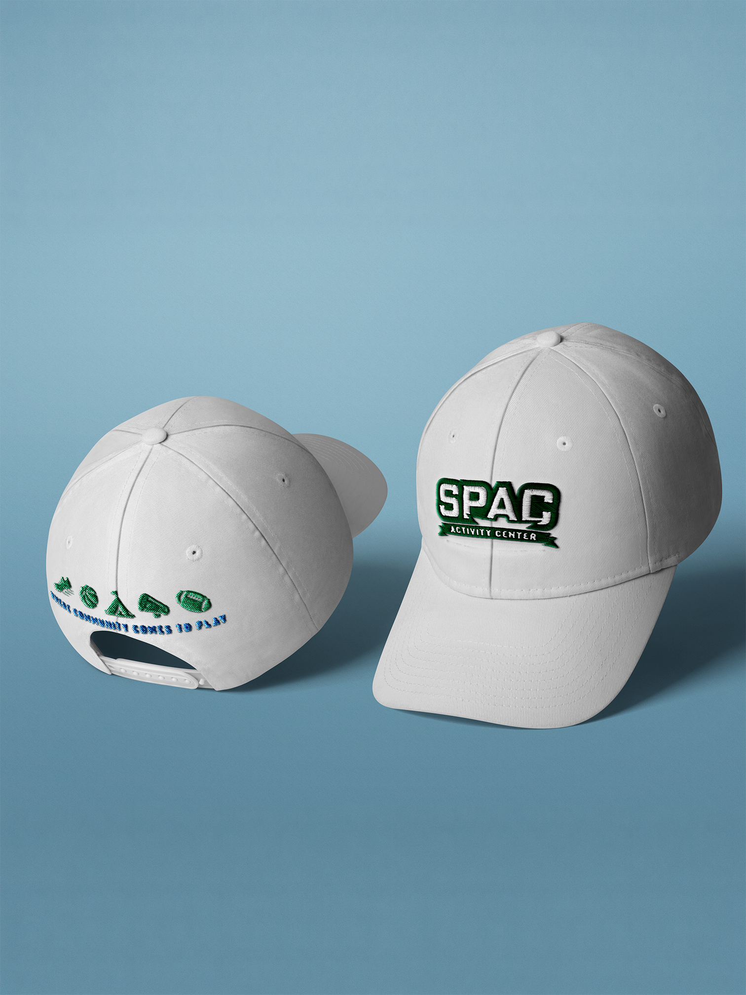
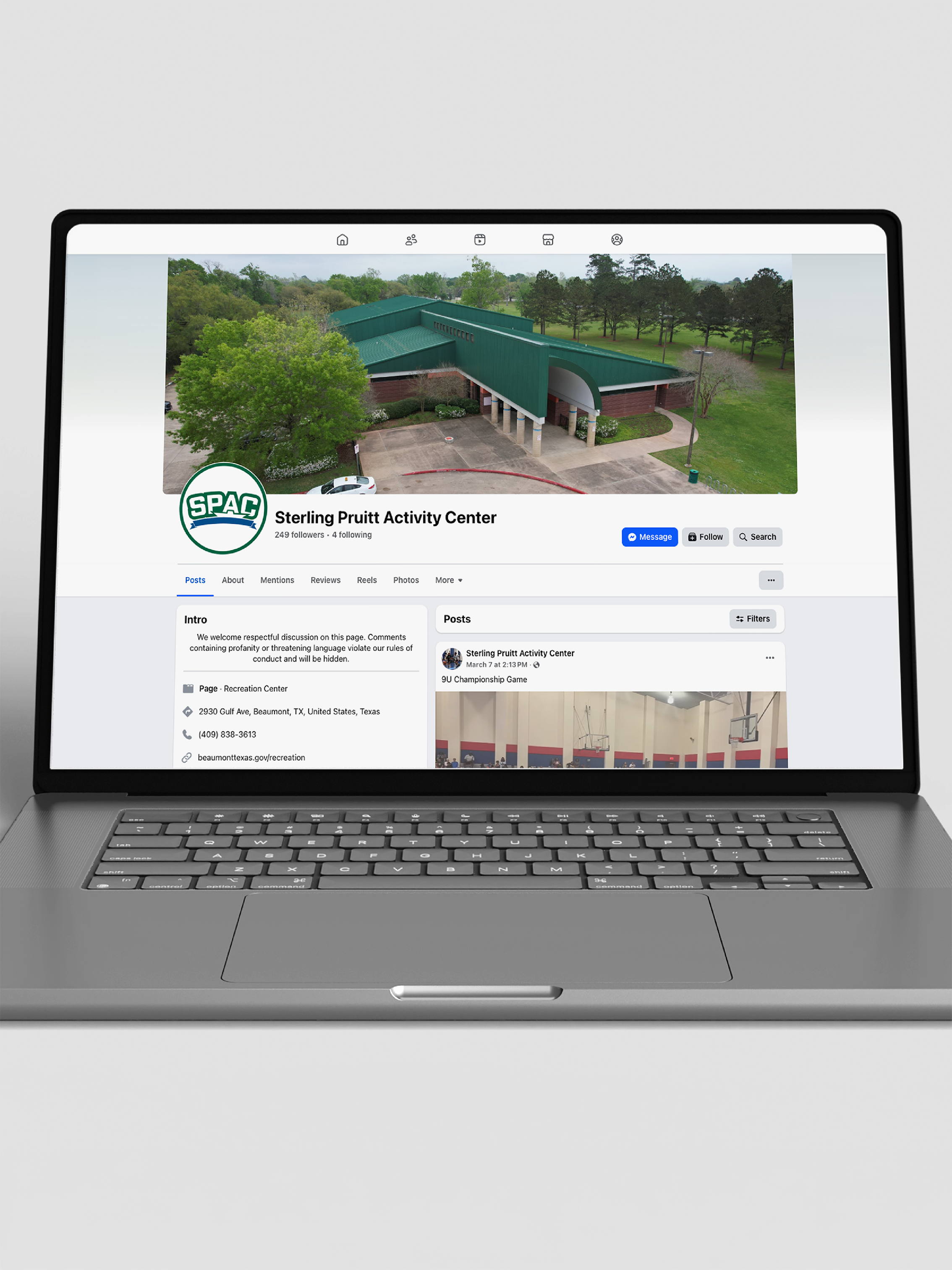
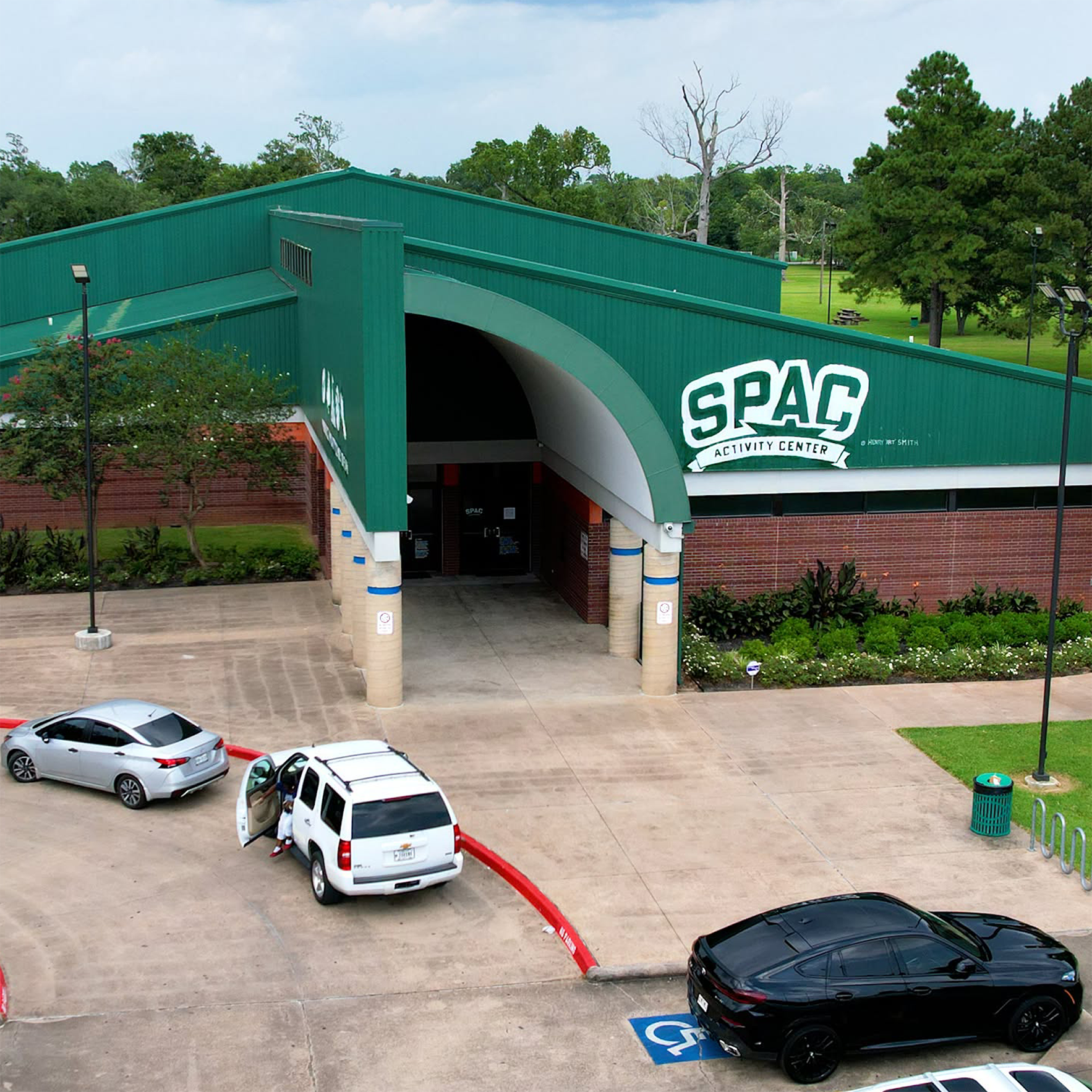
The identity has since been adopted and moved into real use, including marketing, apparel, and signage. Henry “Art” Smith, a local muralist, painted the signage on the building.


Bringing identity into the event
State of the City pushed that flexibility further. The Communications team was asked to turn the traditional civic address into a larger community experience. Each year’s theme needed to work across the marketing, printed pieces, videos, clothing, and venue. I had to consider which parts of Beaumont would keep the City recognizable as the theme took on more of the design.
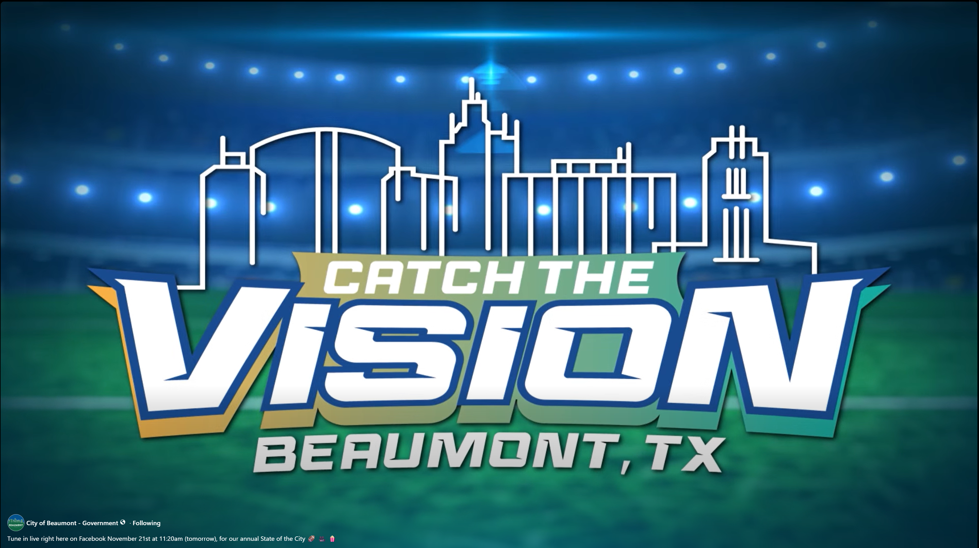
Sadie Atha created the original skyline mark and implemented typography and gradient treatment. We collaborated on the event direction, which I extended into marketing and applications.
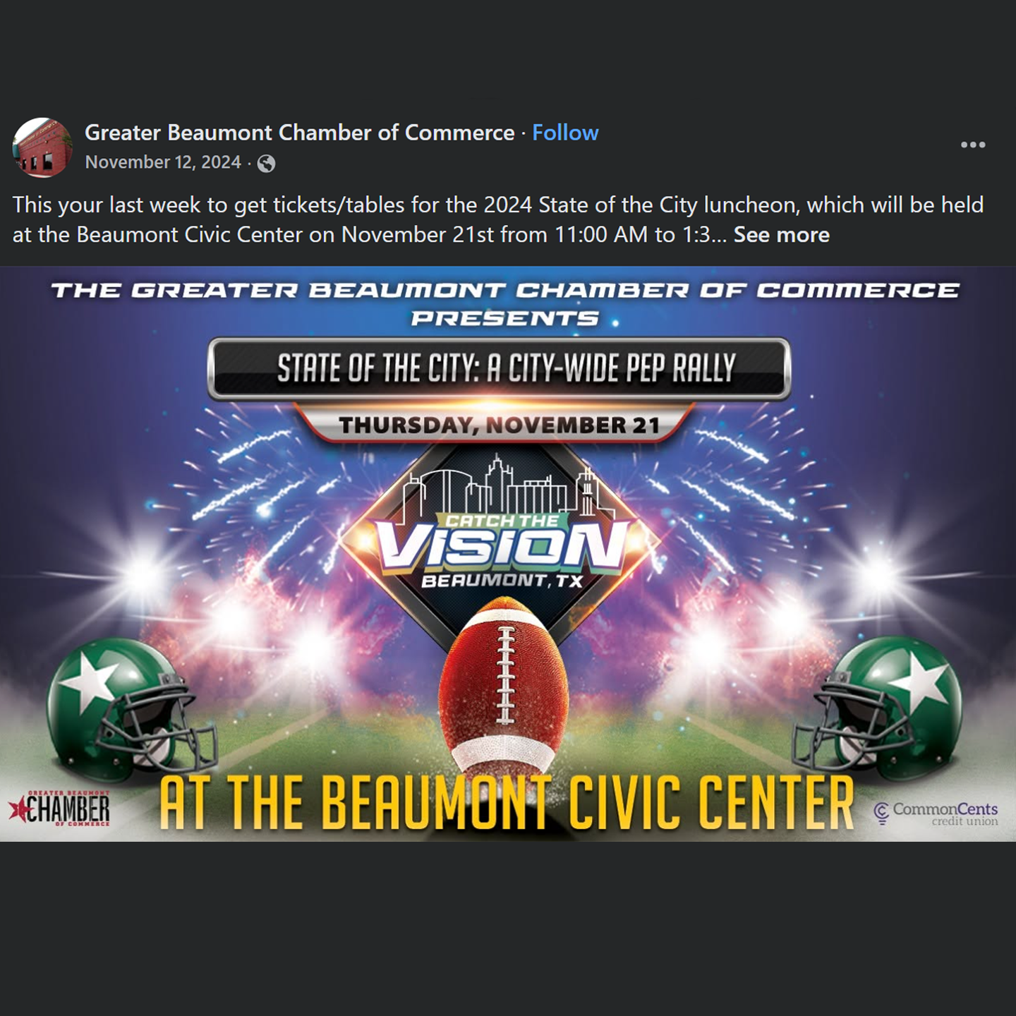
Marketing required digital and print, with contributing partnerships approving and distributing.
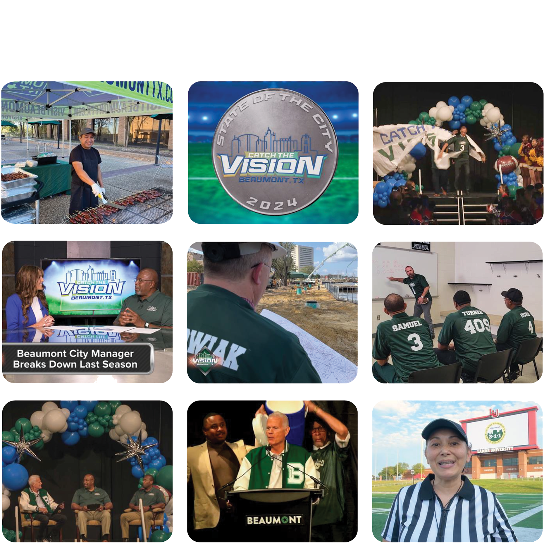
My work included the jerseys, Mayor’s letterman jacket, broadcast and sponsorship graphics, event signage, filming support, and event videography.
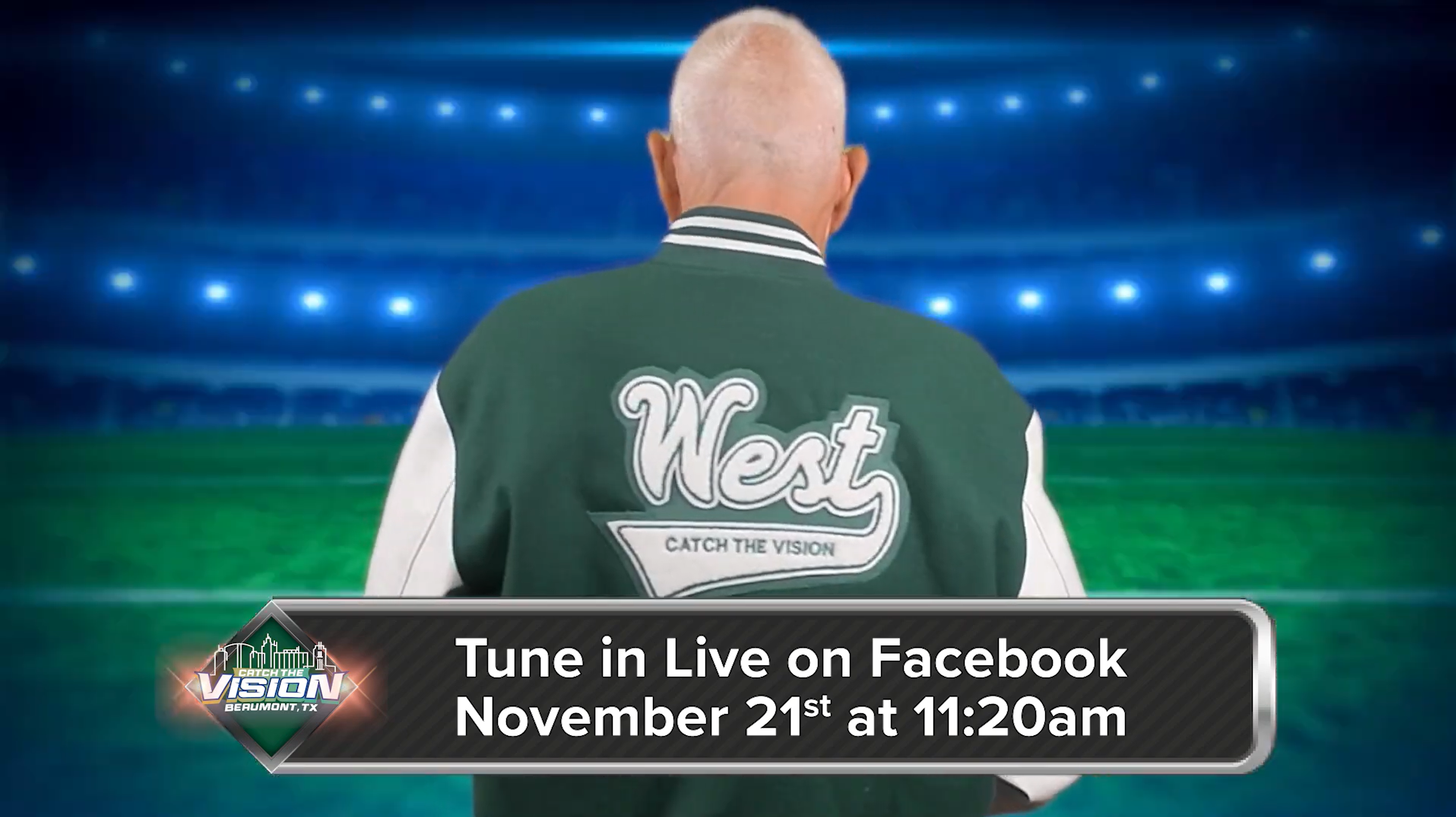
2024 Catch the Vision
For Catch the Vision, the team built a football-style pep rally. Sadie Atha and I collaborated on the event identity, bringing Beaumont’s skyline together with sports imagery and typography.
I carried that direction into the marketing with stadium and football imagery, along with City iconography. The skyline and green-and-blue treatment kept the connection to Beaumont, while the sports visuals brought the Friday Night Lights.
The theme became part of the event environment through what the presenters wore, local high school bands and teams, and the event's presentation.
The State of the City’s attendance grew by 60%, while recorded views increased from 158 to more than 6,000.
Attendees applauded the high-energy event and said they could see and feel the City ready to "Catch the Vision".
A different kind of night
The 2026 Beaumont Awards presented the City’s 2025 accomplishments through an Oscars-inspired red-carpet event. I participated in brainstorming and pitch sessions from the beginning, helping the team develop departmental stories within a cinematic red-carpet experience.
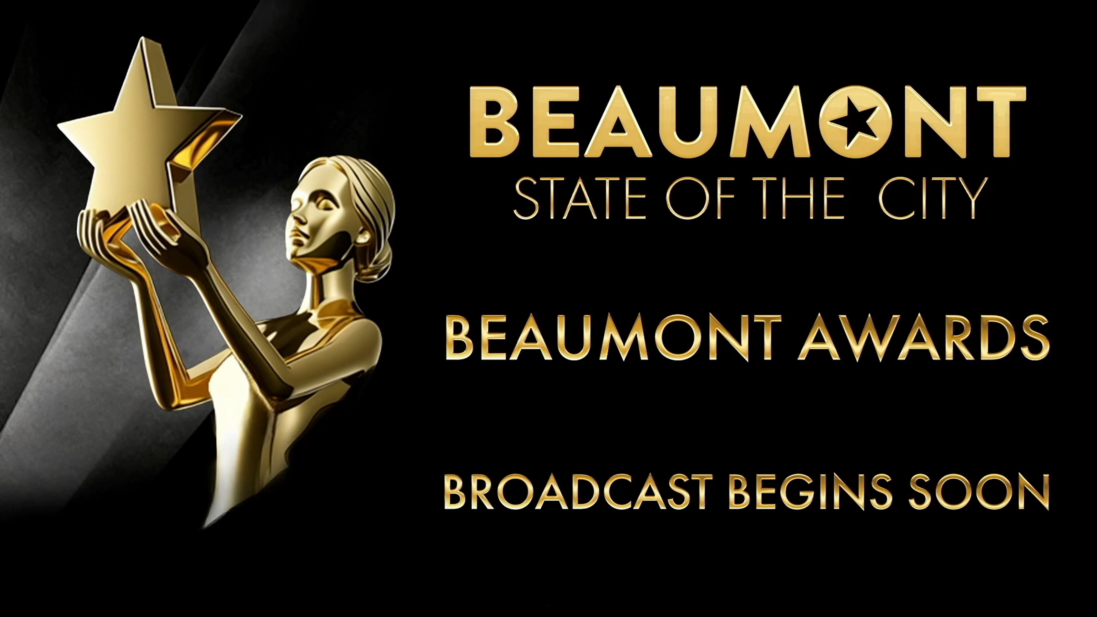
2026 BEaumont awards show
I adapted the Beaumont wordmark into a title treatment and designed an award figure holding the City star. These recognizable assets made the awards imagery specific to Beaumont. Black, white, and gold, stylized spotlighting, and awards-inspired typography established a celebratory expression around them.
My department parody posters worked with the venue and the team’s red-carpet staging to bring City employees and leadership into the setting. The trailers extended that approach onto the screen, using familiar entertainment references and humor to introduce departmental stories. The surrounding event identity connected those different parodies, allowing each its own character within the same Beaumont occasion.
The presentation also needed to make the year’s accomplishments clear. We paired the trailers with department heads delivering factual updates, supported by a program guests could read and reference. I proposed closing with a Q&A to give attendees an opportunity to ask City leaders questions. The cinematic treatment provided an engaging framework, while the speakers and printed information supplied the detail.
My work across graphic design, trailer production, and peer critique helped connect the event’s visual expression with how its information was presented. Beaumont’s wordmark and star provided continuity across an experience that moved well beyond the City’s everyday communications.
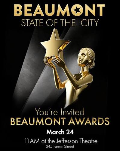
The star-bearing award figure and stylized spotlighting established the cinematic treatment across invitations, social promotion, and presentation slides. A secondary typeface selected from the Oscars’ official style guide added character to themed applications.
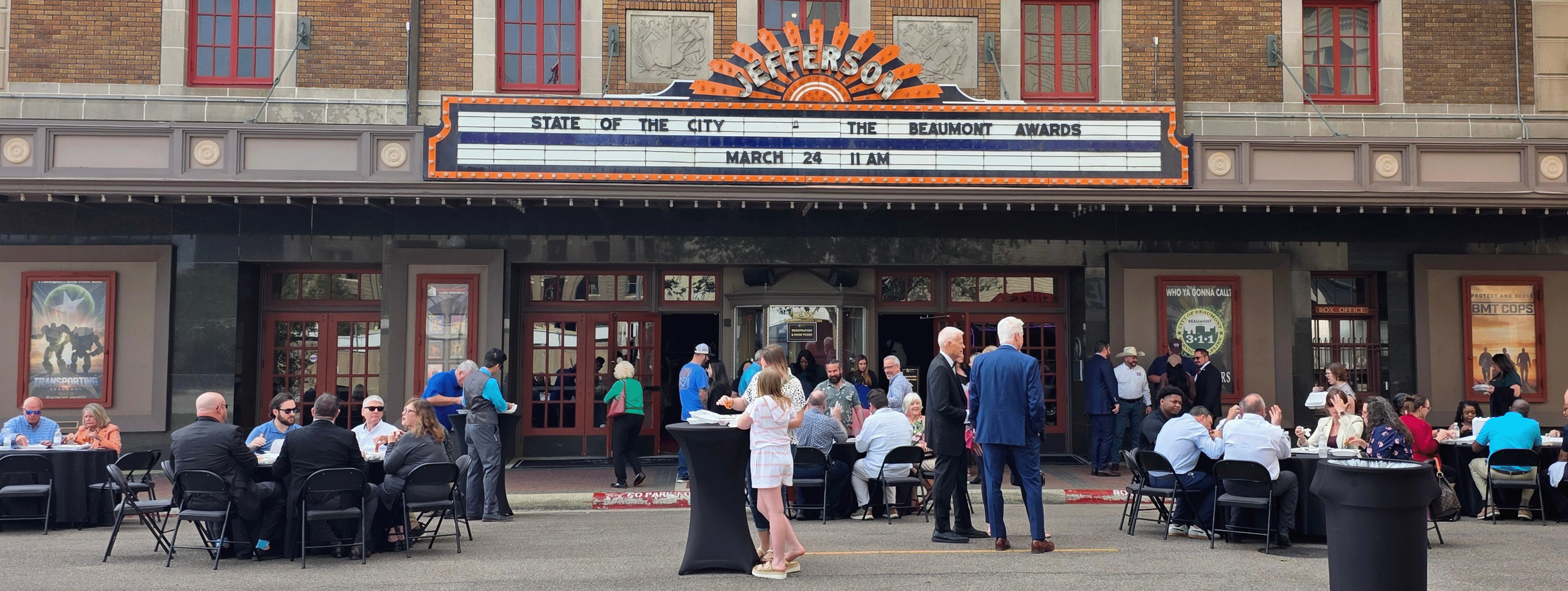
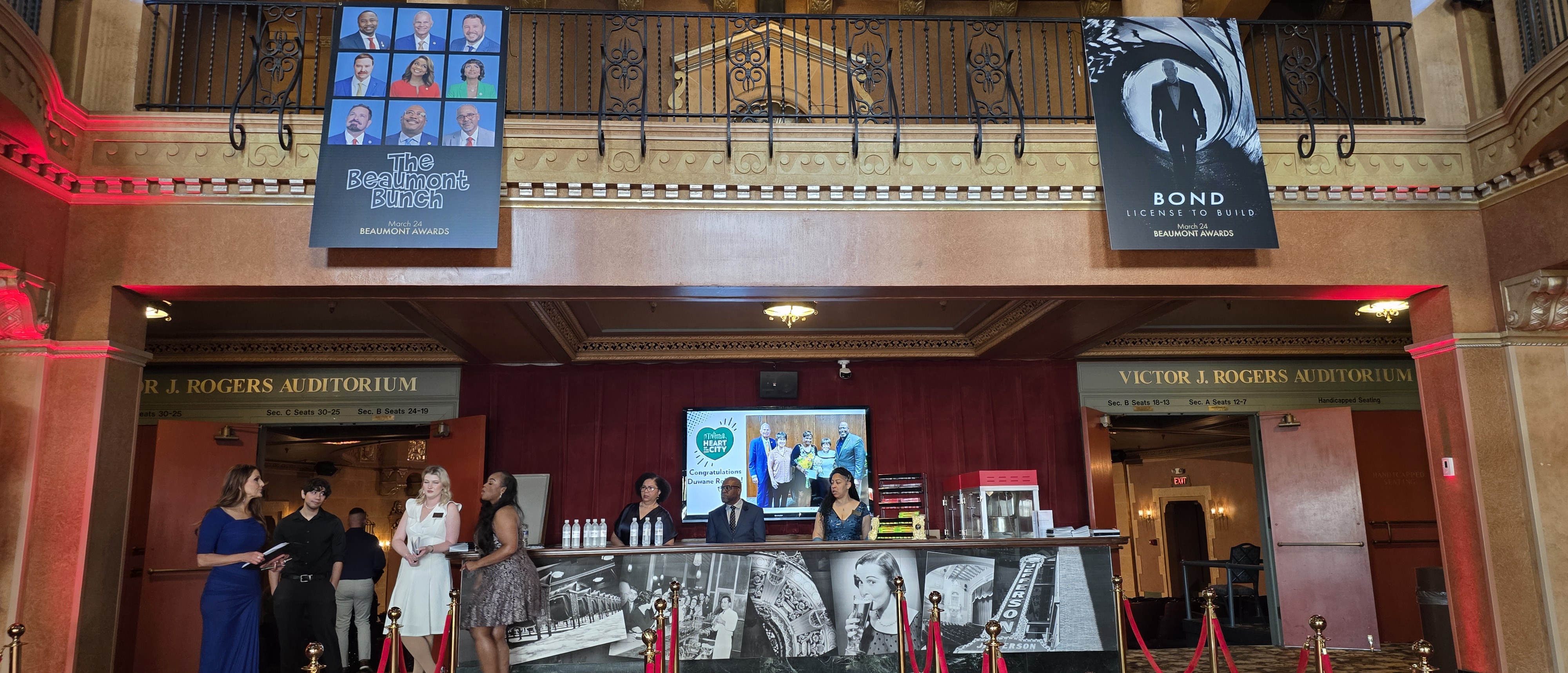
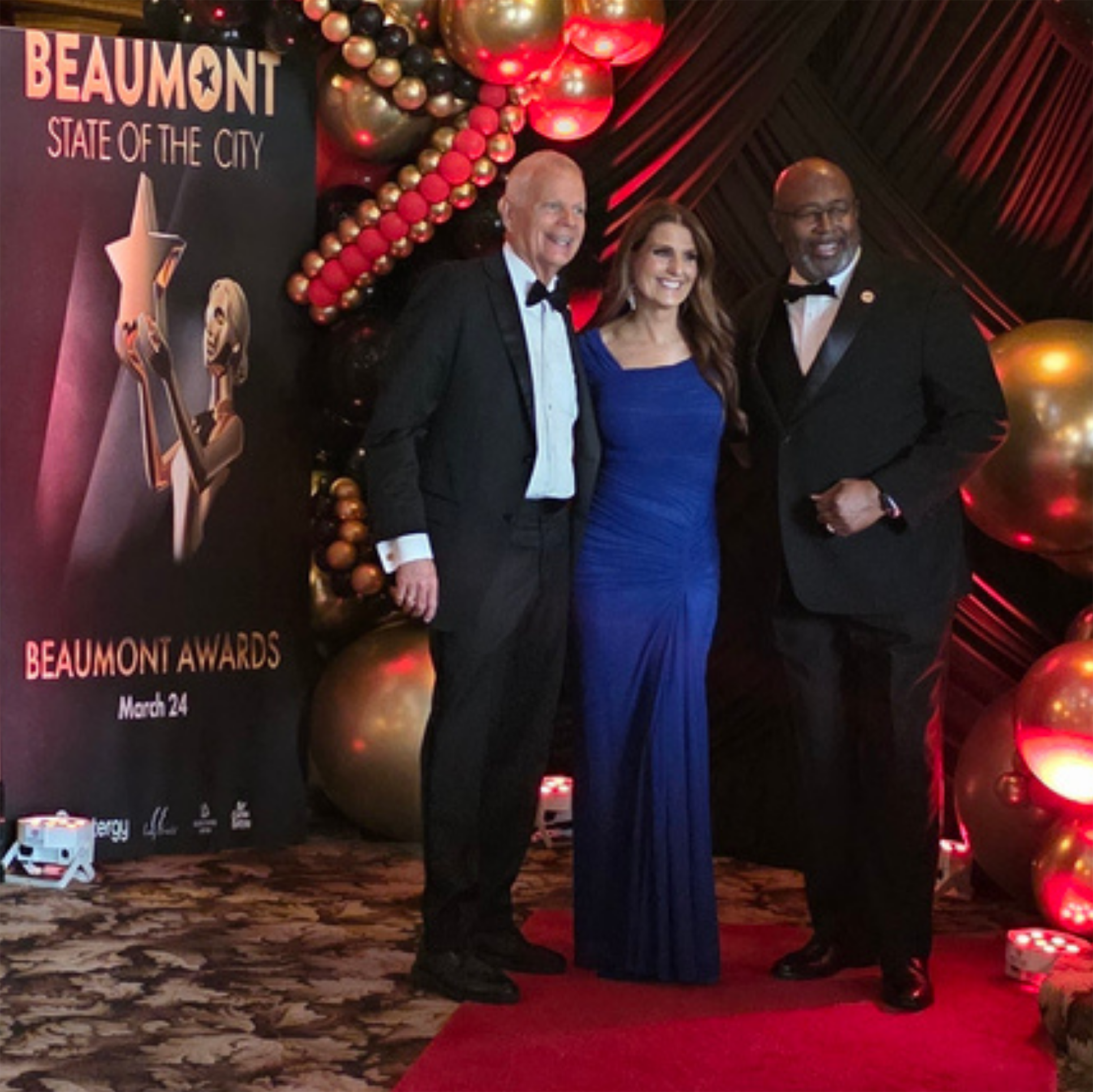
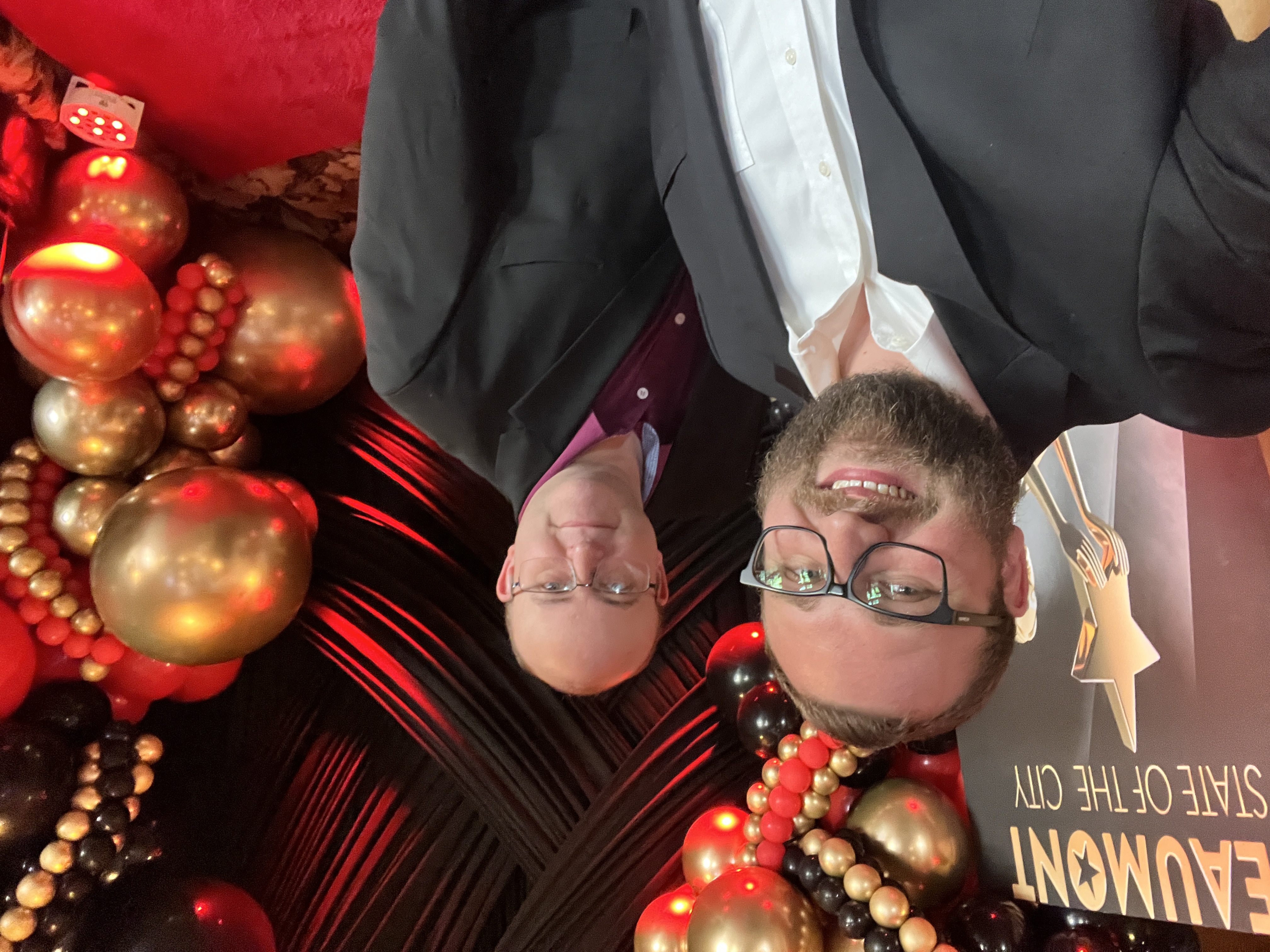
My posters formed part of the environment alongside the team’s rented statues, balloon arches, red carpet, and photo opportunity.
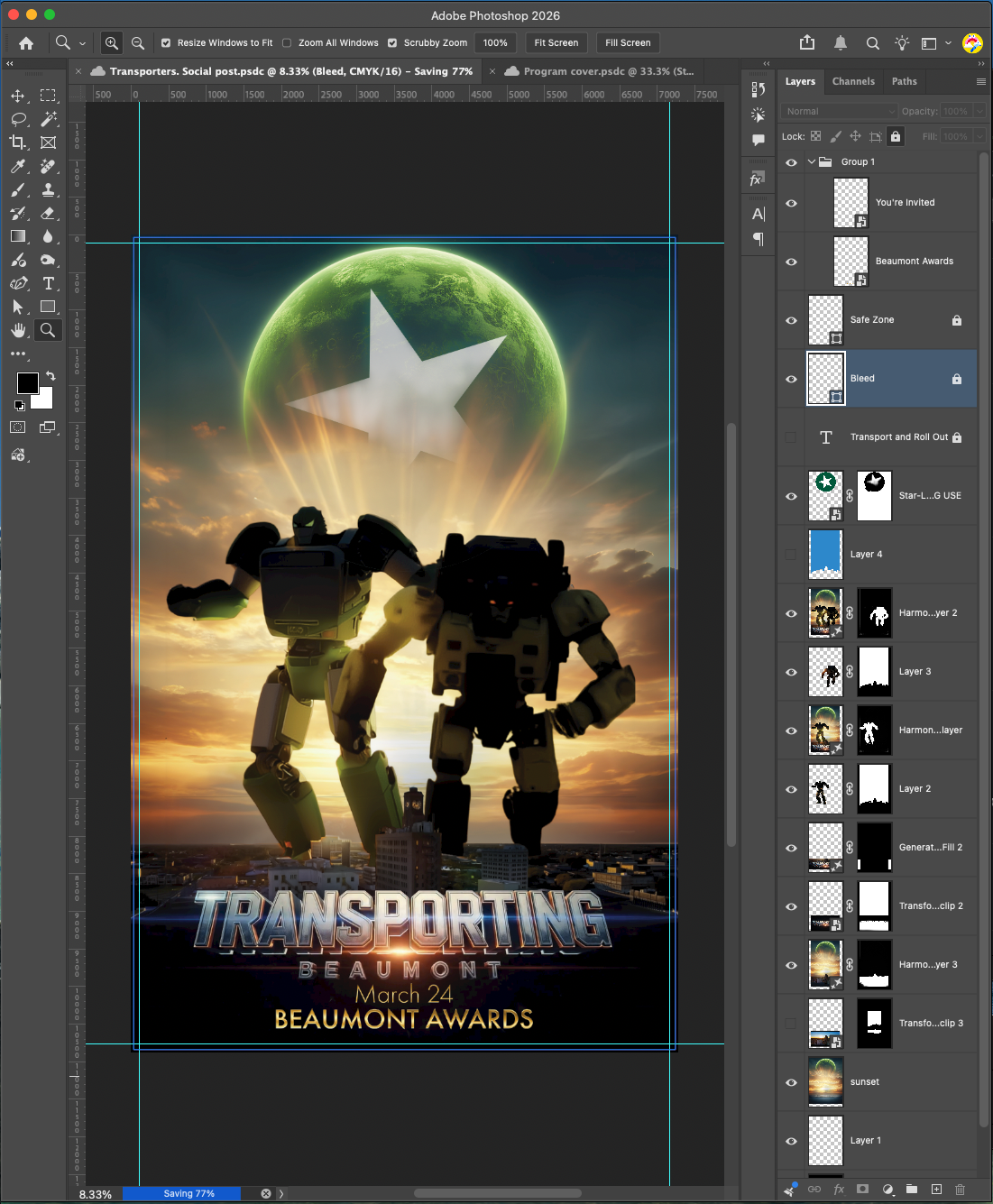
Parodies included Bad Boys for Police, the Brady Bunch for City Council, Bond for the Mayor, Transformers for Garbage and Transit, and Ghostbusters for 311, each designed in Photoshop.
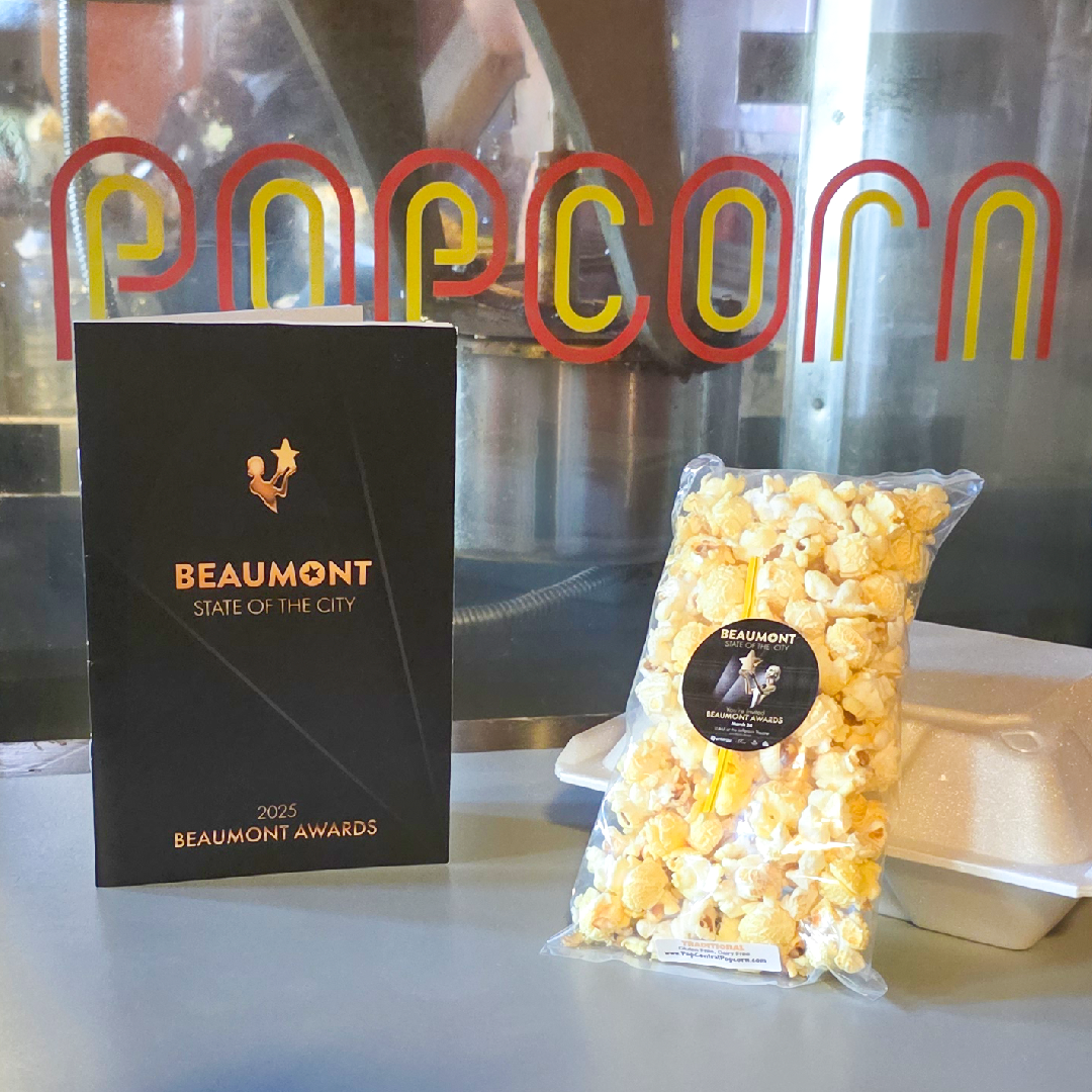
I translated the spotlight motif into an abstract, layered cutout treatment around the beveled two-dimensional award figure, giving the printed cover its own expression of the event identity.
Event stickers on the popcorn packaging carried the identity into the snack packs provided to guests, extending the movie-going setting into a small physical detail.
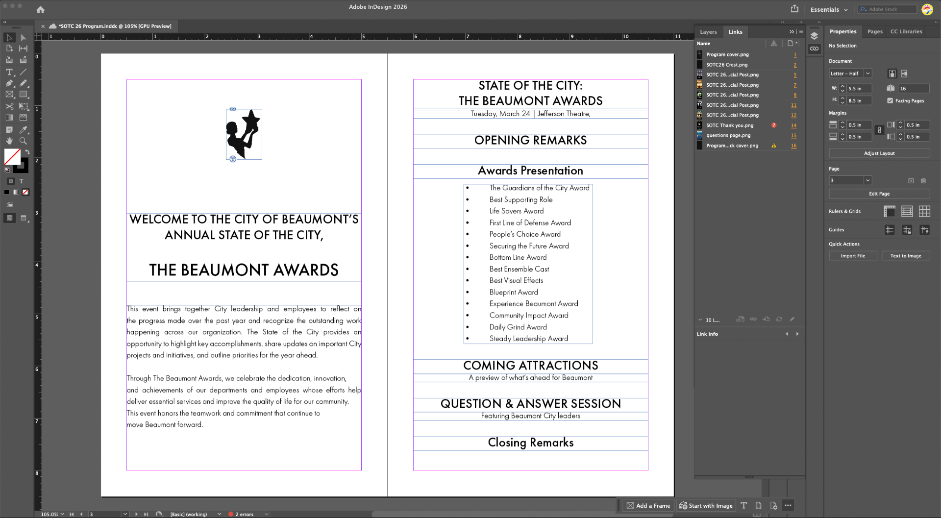
The interior uses a quieter hierarchy to support the departmental facts presented by the speakers. I designed the layout and provided editorial feedback on the copy.
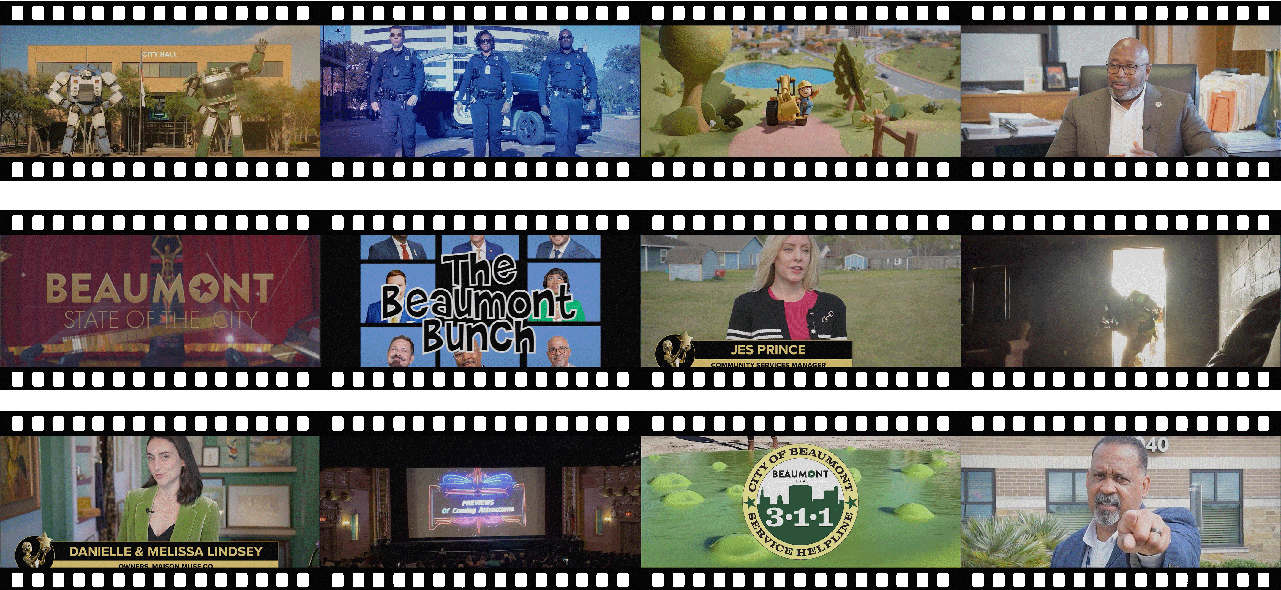
I created Transporters and Molly the Builder from start to finish. On others, I contributed special effects, title treatments, on-screen graphics, and peer critique. I also supported the live event.
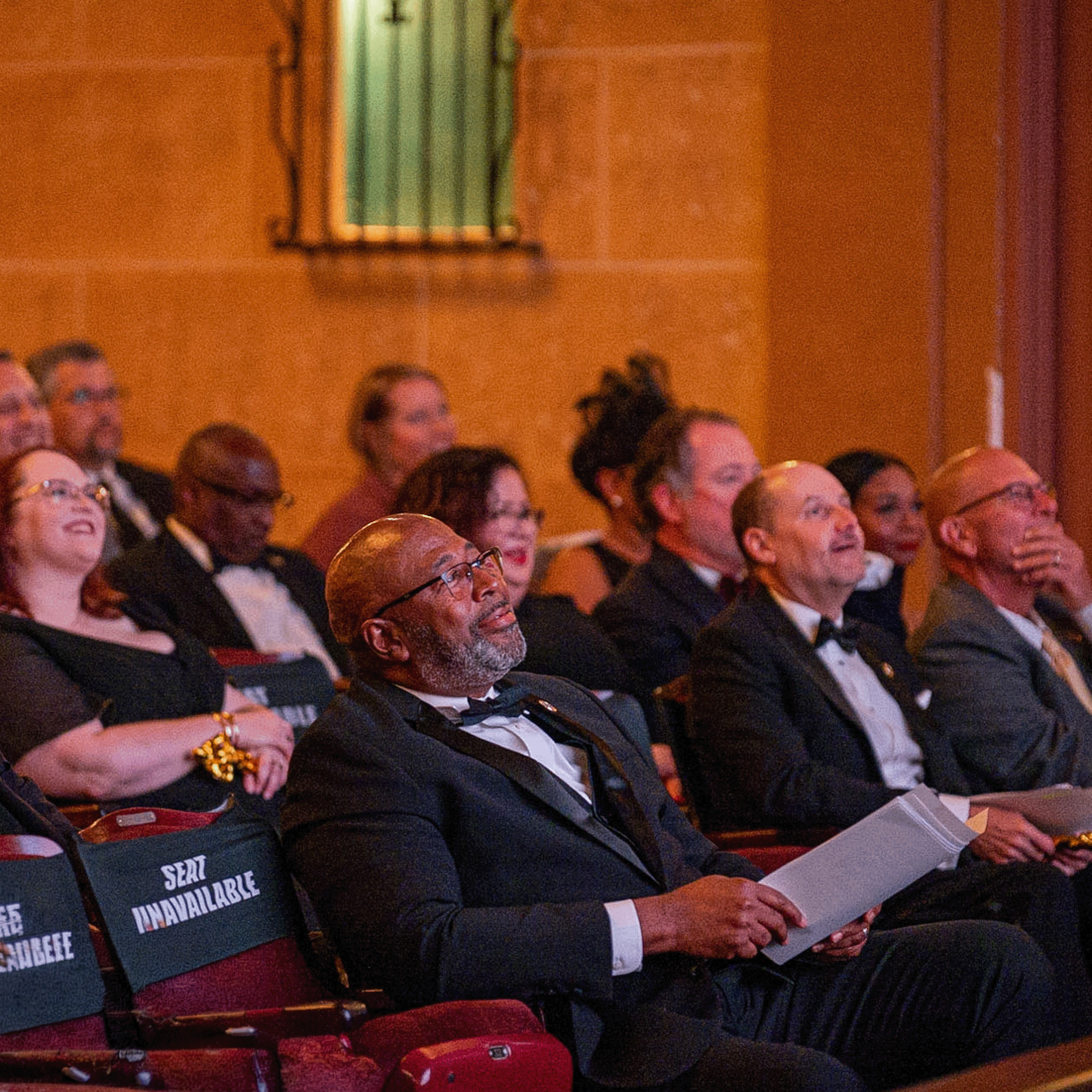
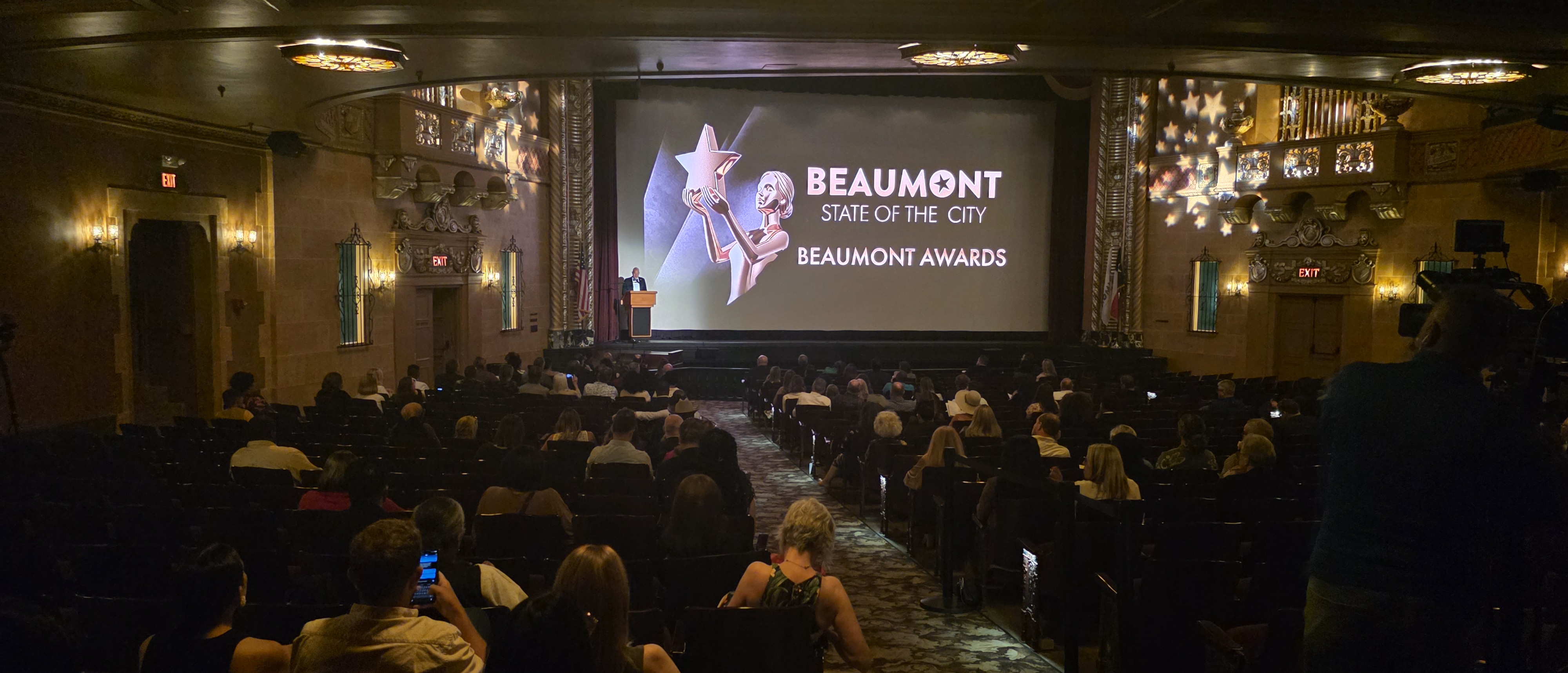
Event photography captured staff reacting to a trailer, while the Beaumont Enterprise reported attendees enjoying the red-carpet photo opportunity. Those moments reflected the participatory character of the event: a public review of the year that also gave people a place in celebrating it. Event coverage
The two events show how I could carry Beaumont through very different themes. The skyline and City colors did more of that work for Catch the Vision. For the Beaumont Awards, I leaned on the wordmark and star while allowing the world around them to change.
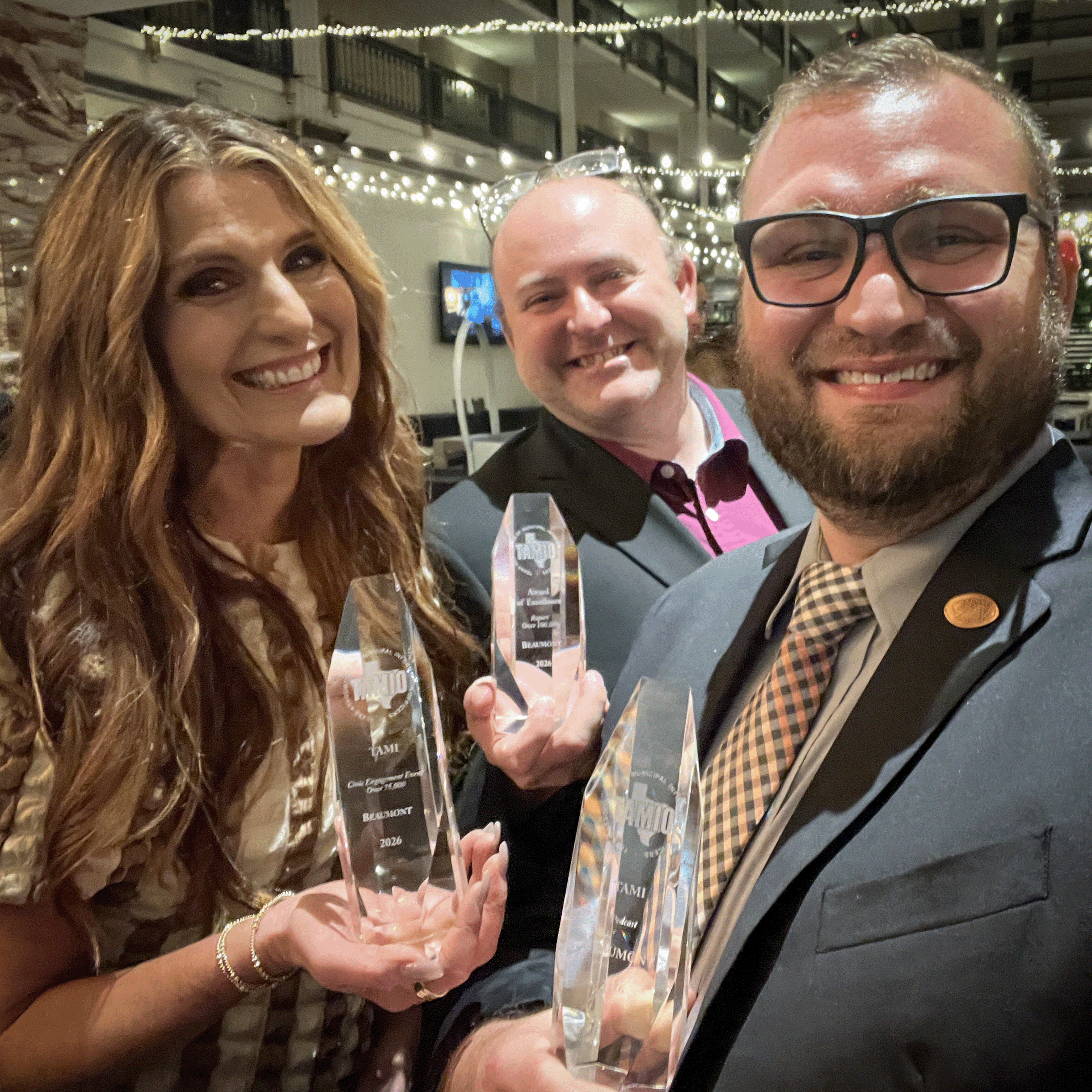
State of the City 24' received Texas Association of Municipal Information Officers (TAMIO) awards.
Best Recurring Event
Best Civic Engagement Event.
Making it work, together
Over time, departments became more willing to involve Communications earlier and ask for help. Their cooperation, along with residents recognizing the work, gave us signs that the effort was making a difference. Recognition from the Texas Association of Municipal Information Officers and the Press Club of Southeast Texas was rewarding, too.
What has mattered most to me is seeing the work become part of how the City communicates. Departments have a shared starting point, facilities have room to express their own character, and events can take on a theme while still feeling connected to Beaumont.