
hexas arcanum
Hexas Arcanum is a tabletop game concept that combines Texas Hold’em with urban fantasy storytelling. Players take on supernatural characters whose abilities influence the game, building on poker’s hidden information, shifting advantages, and escalating stakes.
I began the project with a challenge to myself while teaching game design: take a familiar game and explore how a different theme and new abilities could change the experience. I connected poker’s phases with a three-act story and a three-card tarot reading; developing a rough prototype in which each hand became a chapter of an urban fantasy series.
Once that foundation was in place, I needed to give the game an identity and develop the world around it. The challenge was to make the characters' imagery and components express that world while keeping the additional rules and abilities understandable during play
world discovery
I developed a faction moodboard for the characters of the world. Considering them together helped establish how supernatural archetypes belonged within the setting. Those references informed the characters, symbols, and atmosphere across the game.
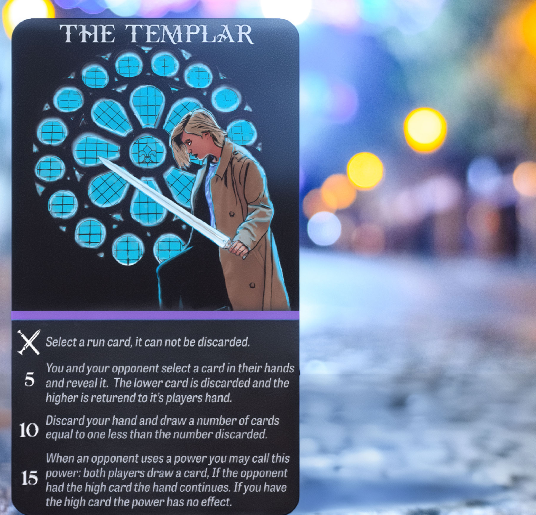
The factions gave players a role within the world: wizard detectives, skulking templars, high-rise vampires, and mafia werewolves. In the game concept, players would choose a character and spend resources to activate abilities drawn from familiar tropes of that faction. Those associations informed both the character’s appearance and how they could influence play, connecting the worldbuilding to decisions at the table.
Additional factions, including cultists and the Old Pantheon, offered directions for expanding the world with new characters and abilities.

I curated references from Pinterest, grouping symbols, environments, character illustrations, and title treatments around the factions. Seeing them together helped me connect each faction’s personality with its setting and color palette, while identifying forms that could inform the suit symbols and overall identity. View Pinterest Board
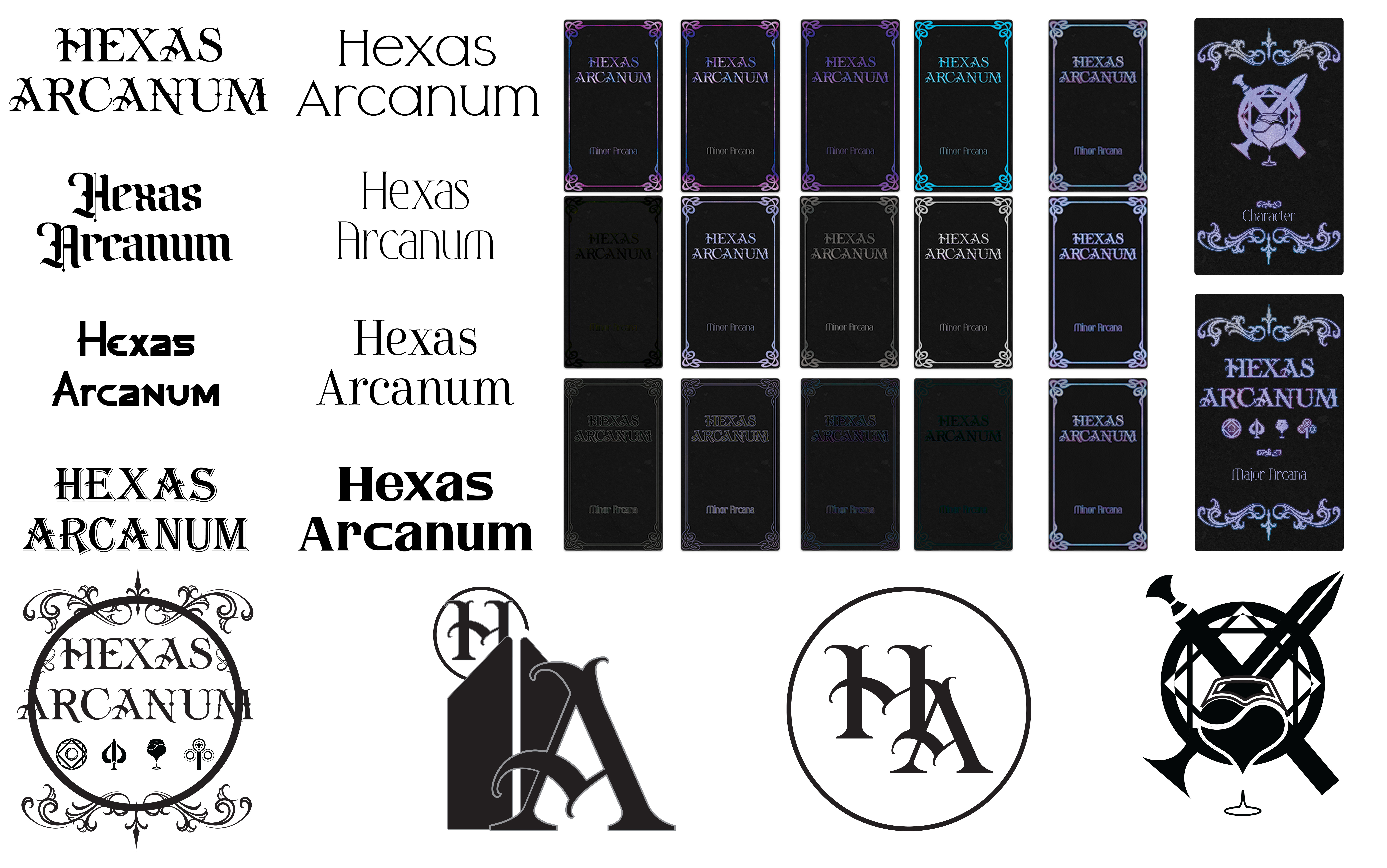
I explored many directions inspired by urban fantasy, finding a balance between contemporary and fantasy. I brought in elements of Rodiron gothic ornaments and arcane text.
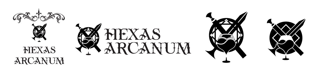

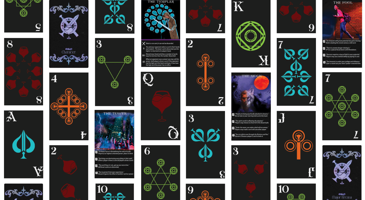
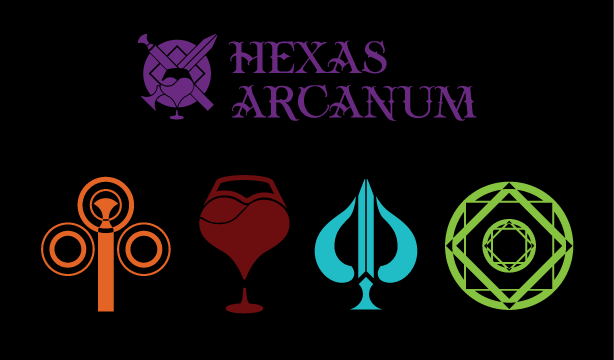
I refined the card suits to show both tarot suits and the poker equivalents with contemporary imagery baked in. Magic sigils, holy swords, glasses of blood, and staffs of power (which also has a paw).
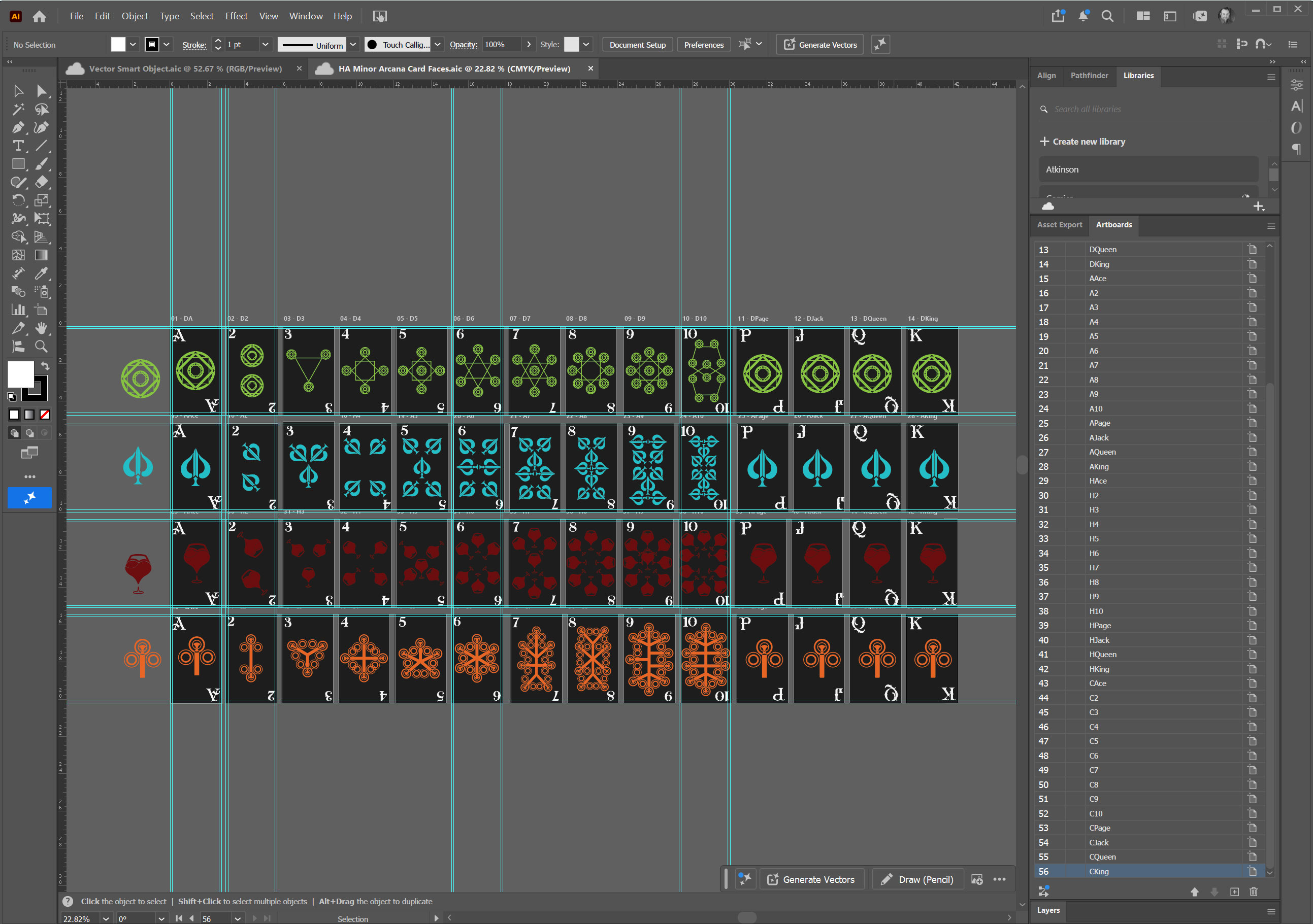
I built the Minor Arcana in one Illustrator file with the deck arranged for batch export and replaceable suit symbols.
a symbol underneath
I explored the logo and card backs together, using urban fantasy title treatments as the reference for the typography. Tension gave the name the character I wanted, and I combined the suit imagery into an emblem that represented the game as a whole. Different arrangements of the title, emblem, and ornament gave me options for the card backs and later packaging.
The two card systems had different jobs. The Minor Arcana carried the familiar ranks and suits used in poker. I developed the suit symbols by combining playing-card shapes with tarot and supernatural references. This kept a visible connection to the underlying game while making the deck specific to the setting of Hexas.
Suit colors stayed consistent, while factions could have their own palettes and share associations with a suit. I built the Minor Arcana in one Illustrator file with the deck arranged for batch export and replaceable suit symbols.
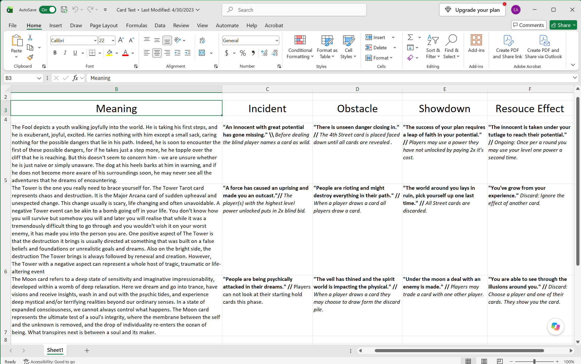
The Major Arcana introduced the story events and their effects on play. Each narrative statement was paired with a gameplay consequence, with icons identifying the relevant act.
The connection between the two mattered: The ability needed to express what was happening in the story.
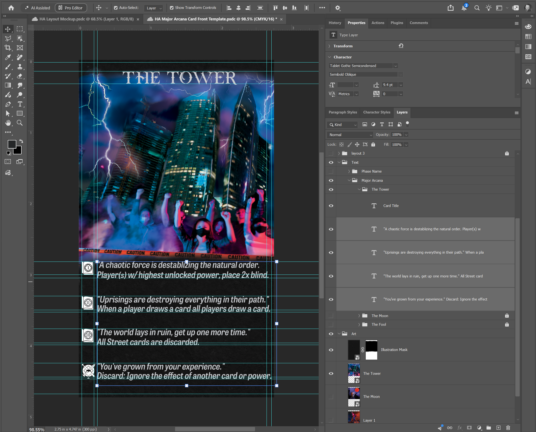
I carried that relationship into the illustrations. For The Tower, skyscrapers, lightning, a crowd, and caution tape placed the theme of upheaval in a contemporary city. The instruction to discard all Street cards extended that disruption into the game itself. Photobashing and digital painting allowed me to build these scenes around the story each card needed to communicate.
The Major Arcana required a different production setup from the numbered deck. I created a template where illustrations and character text could change while retaining their placement and masking. Tension carried through to the card names, paired with the thematic but easier-to-read Tablet Gothic Semicondensed Semibold Oblique for the longer text.
The template preserved the card’s construction while I developed the individual images and abilities.
setting the stage
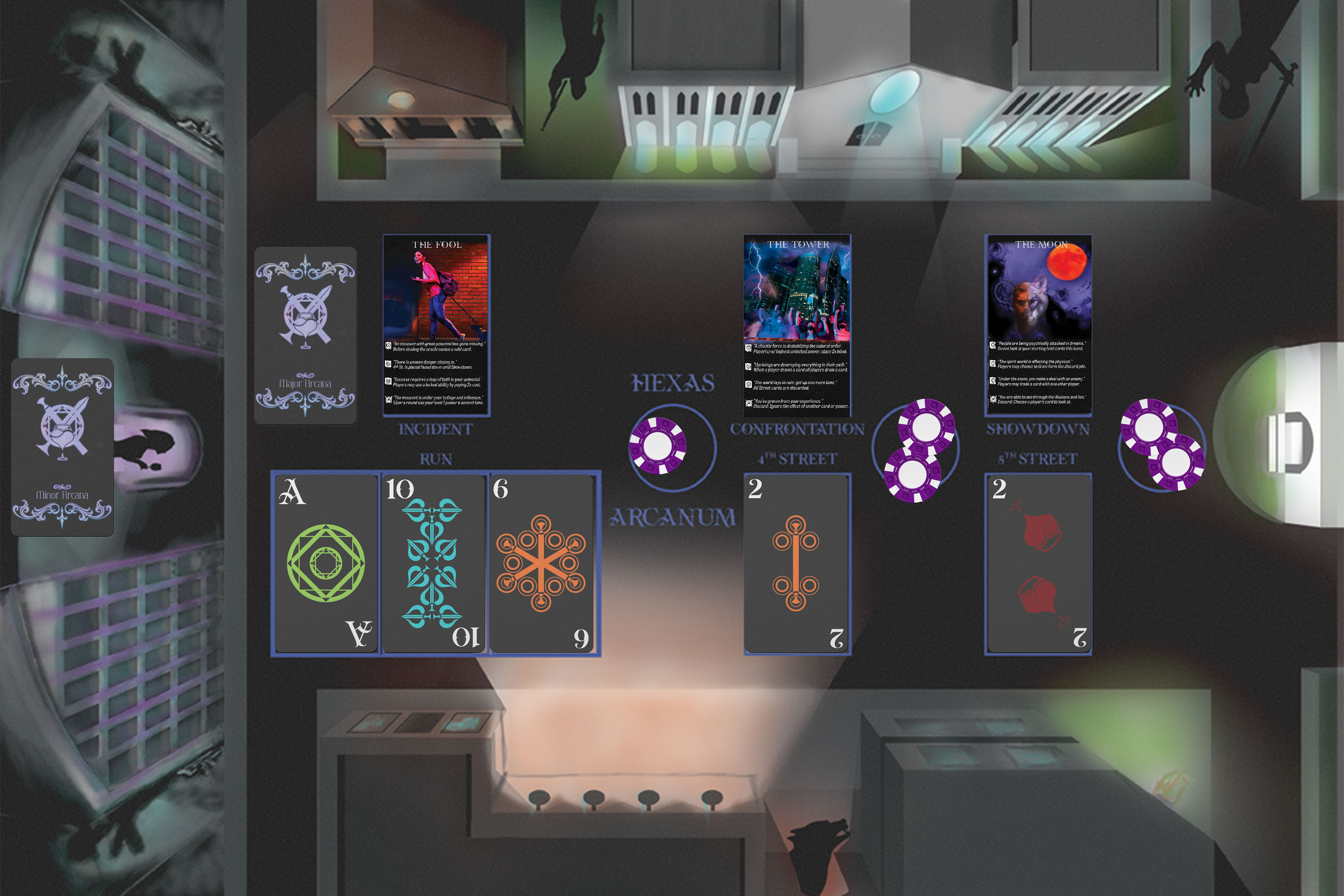
I developed a setting moodboard for the locations of the world. Conceptualizing where each of the different factions would stake their territory and what the "street" would look like. Combined with the faction references I designed a game mat to bring players further into the world.
I imagined the players sitting above the world, making plays as they looked down on the streets they were fighting for.
While the moodboard guided the city’s appearance and atmosphere, the composition also had to accommodate the cards and guide players during play.
I brainstormed and sketched before refining the layout with a grid. From there, I built the illustration in layers, working from grayscale into color and lighting so I could develop the setting around the component spaces.
I imported the base cards and mat into Tabletop Simulator to see them together in a tabletop setting. This gave me another view of how the individual assets related once they occupied the same playing surface.

Conceptualizing where each of the different factions would stake their territory and what the "street" would look like.

The game mat visually organizes the phases of play, reinforcing the narrative structure of each hand as a chapter within a larger story while helping players track the progression of the game.

I built the base prototype in Tabletop Simulator to test component layout and simulate the game.


loose in the world
With the cards and play mat developed, I turned to how Hexas could be presented as a product and how its identity could extend into merchandise.
The packaging concept took the form of a book-style box, connecting its presentation to the game’s storytelling. I carried the title and ornament onto the cover and placed the suit symbols along the spine. Inside, the proposed arrangement brought the decks, counters, smaller pieces, and rolled mat together as a complete set.
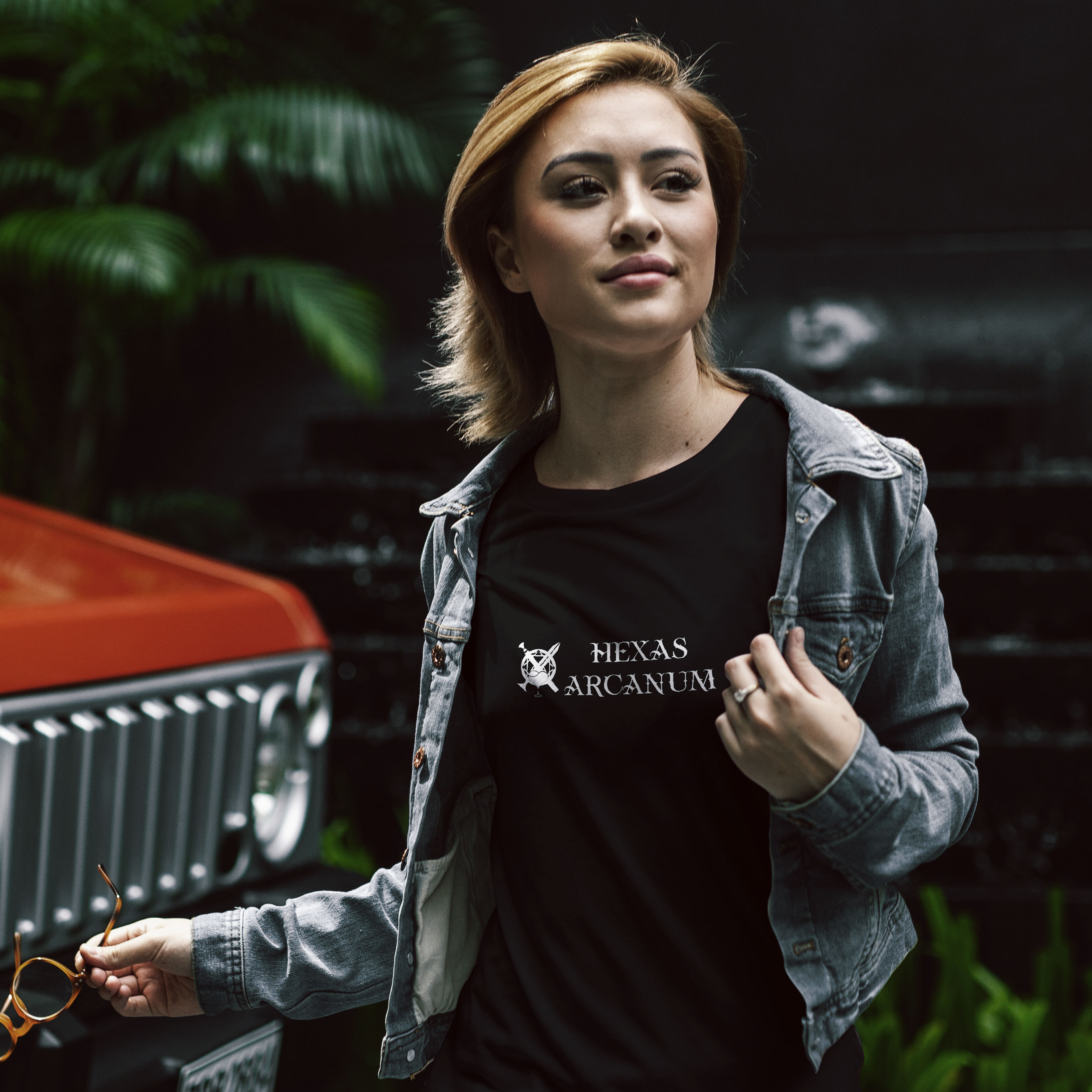
The packaging used the more decorative mark. For the shirt, I paired the emblem and name in a compact, single-color treatment. Contemporary settings in the mockups reinforced the urban fantasy direction, showing how the cards and merchandise could carry that character beyond the illustrated world.
.jpg)
Hexas Arcanum allowed me to apply my professional design experience to a game. Brand development became the identity of a fictional world. My experience handling detailed content and revisions informed the card systems, while illustration and typography shaped how that world appeared across the components and packaging.