
REd, White, & Clix
Red, White & Clix brings players together for a charity tournament benefiting organizations that support veterans. The game, HeroClix, uses collectible miniature figures of comic-book characters in tabletop battles.
I was initially asked to design the event’s flyer in 2025. The work expanded to include an event logo and sponsorship materials. My role was to give the event a recognizable identity and help communicate both the experience of attending and the reason for supporting it.
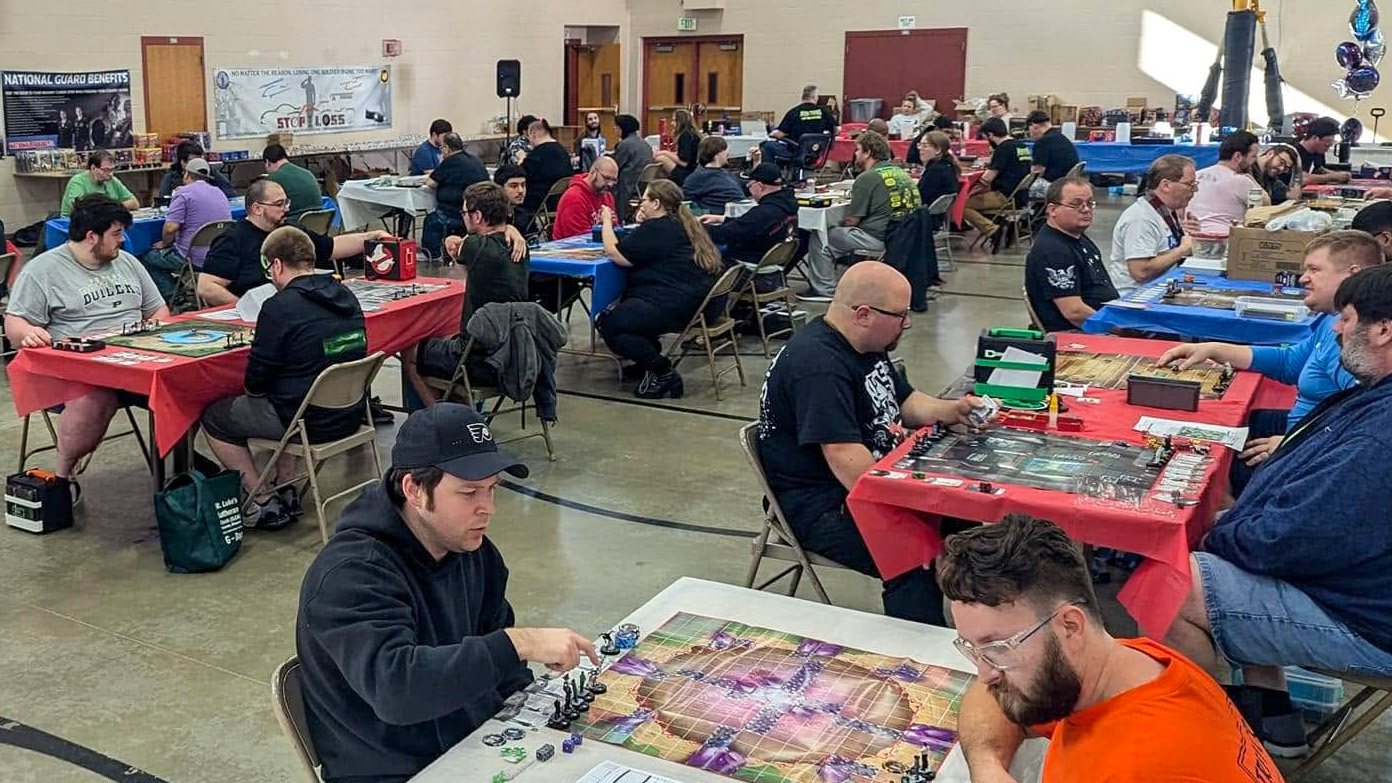
2024 Red White & Clix Heroclix Charity Tournament
Connecting the game and the mission
When I began designing the flyer Red, White, and Clix had an existing logo that had a military memorial within the I of the logo. Its detailed imagery and tightly arranged lettering limited how it could be reproduced and adapted to applications.
As part of the project, I proposed updating the logo to keep the HeroClix reference and patriotic identity, drawing from action-figure graphics familiar to many collectors.
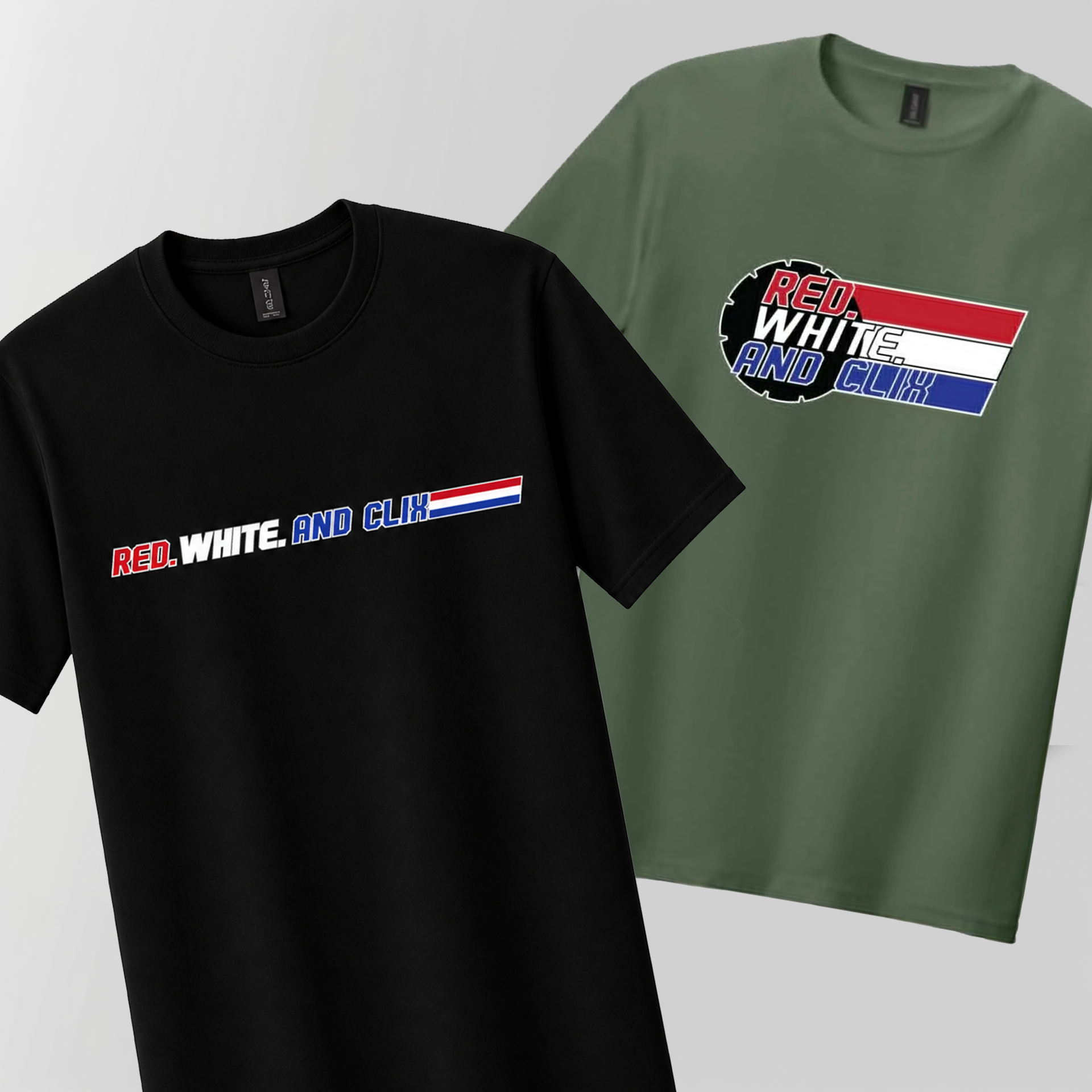
I designed bold slanted lettering and converted the red, white, and blue into stripes, creating a recognizable mark that connected to HeroClix, the military, and pulled on nostalgic toy collecting that, based on the perceived demographics of the game, players would relate to.
I developed a primary and horizontal arrangement of the redesign.
The new mark was to represent the event, while the client retained the original logo for the organizing board.
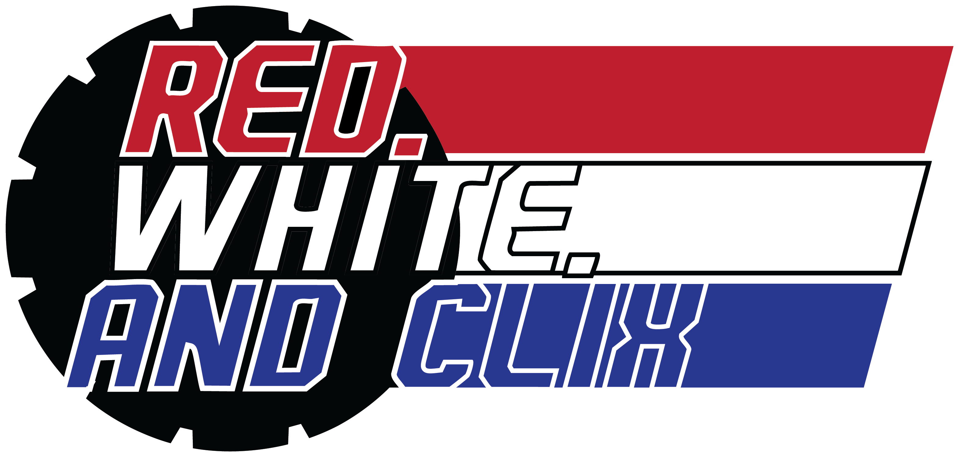
I retained the dial and patriotic colors while simplifying the forms and reworking the lettering. The three-stripe treatment connected the typography, and primary and horizontal arrangements allowed the logo to fit different applications.
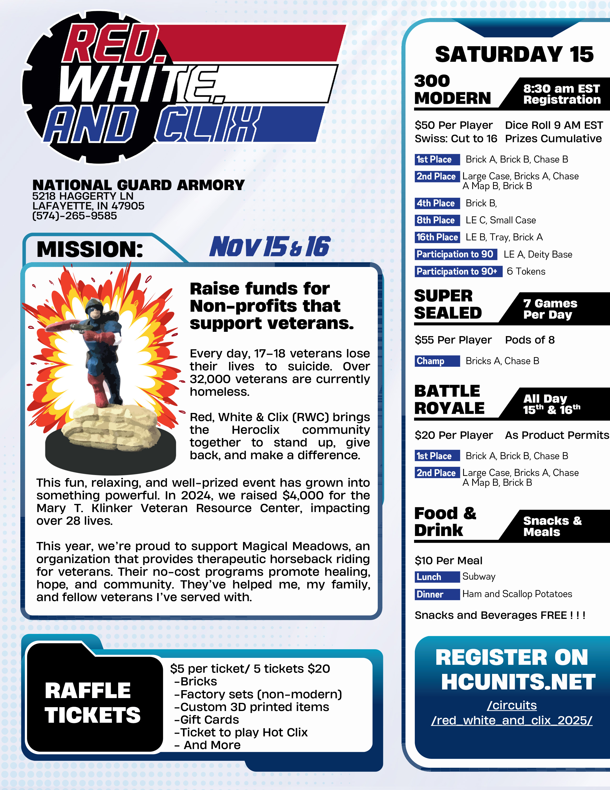
Combining action figure blister-pack information strategies with a high-tech military dossier, along with an illustrated character and thematic burst, created an exciting and fun marketing tool.
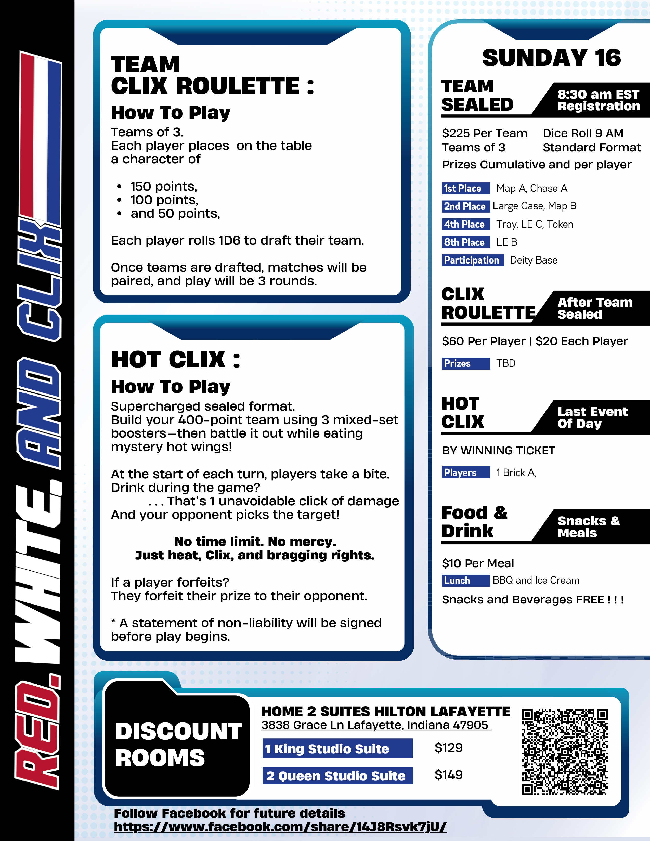
Gradients, illustrated panels and digital dossiers imagery supported informational hierarchy.
Turning the Event into The Mission
For the flyer, I drew from the illustrated cards behind action figures in their packaging. Those cards paired dramatic character imagery with biographies and other details, making them a useful reference for an event aimed at players and collectors. They also offered a way to approach the flyer’s main challenge: fitting a full weekend of information into a limited space.
I combined that packaging influence with a high-tech computer dossier aesthetic. Framed panels separated tournament rules, special games, schedules, and travel information, while variations in their treatment helped distinguish the sections. The aim was to make the details approachable within a design that felt connected to the audience’s interests.
Giving the charity's mission the spotlighted panel emphasized the reason for the event alongside the competition.
The new direction was approved and received a strongly positive response when it was shared with the charity's community.
Building for support
For the 2026 event, Red, White & Clix made a goal to gain sponsorships to grow the charity and tournament.
A potential sponsor may know nothing about the game. They need to understand what Red, White & Clix is, the organization is credible, why the mission matters, what their support would accomplish, and what they receive in return.
I could not take the immersive approach from the player flyer and apply it to a business document. The brand needed to stay recognizable, but its shift to a professional tone.
The provided sponsorship material was also content-heavy and did not fully support the financial and participation goals the client was trying to reach.
Before laying it out, I reviewed sponsorship examples and researched sponsorship behavior, social proof, tier structures, and how successful sponsorship opportunities are presented to encourage participation.
The sequence became:
Understand → Trust → Care → See Value → Choose → Act
The sponsorship tiers were part of that decision structure.
The $5,000+ Title Sponsor establishes the upper end and is limited to one presenting partner. Lower levels create progressively more accessible ways to participate.
That changes: Will you sponsor us?
to: How would you like to support us?
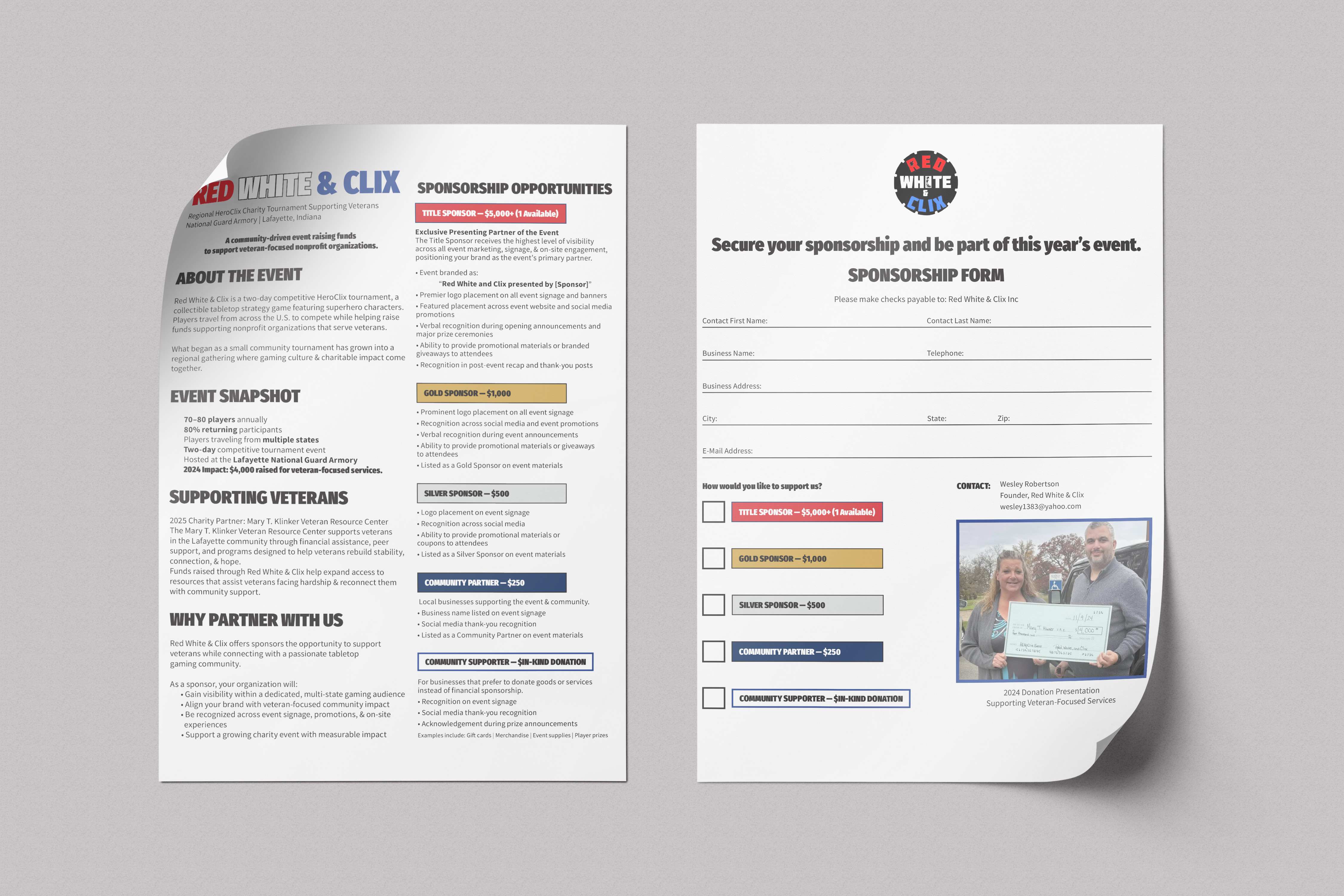
The back of the sheet then brings proof and action together.
A photograph of the 2024 donation shows that Red, White & Clix has followed through on its mission before, while the adjacent form allows an interested sponsor to select a level, provide their information, and return the document directly to the organizer.
The photo provides social proof.
The form removes friction.
-Front.png)
I reorganized the material based on psychological principles so that readers encountered the mission and previous charitable work before the sponsorship levels. Establishing what they would be supporting before asking them to choose a commitment. Tier headings are inspired by service ribbons to indicate Sponsorship level.
-Back.png)
The stakeholder's logo heads the sponsorship form with a photograph of a previous donation, establishing the credibility of the charity's purpose at the point the decision to support is made.
The event has attracted support from local businesses and tabletop gaming organizations and received coverage from WLFI.
My contribution was to give the organizers materials that connected the appeal of the tournament with the charitable work behind it, helping them explain both why people should attend and support it.